 Nov 7, 2023
Design Styles for Scenes
Define reusable styles for Scene design elements to accelerate content creation while maintaining consistent branding.
If you’re new to Scenes, this should be a smooth ride. If not, the main thing to know is that Scenes no longer share default settings with other in-app experiences. You still set default colors for the background and the dismiss button, but all other background, text, and button settings are handled by styles.
In addition, you can now set indicator colors.
Custom view, text, and button styles
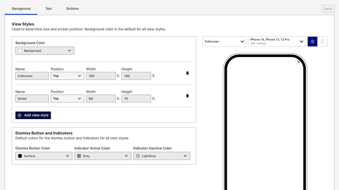
Instead of only Modal or Fullscreen options, now you can create custom view styles. You can also create your own text and button styles! Even better, you no longer have to set up multiple text and button defaults for Modal then repeat them for Fullscreen.

How it works:
Add a style in your Scene defaults, giving it a name and defining its properties.
For example, view style properties are height, width, and position (top, middle, or bottom).
Select the style by name when configuring individual Scenes.
If you are thinking, “Hey, that’s how Color SetsA named pair of hexadecimal color values supporting device Light and Dark modes. Color sets can be selected for any color field in a scene and when configuring the default appearance of Scenes and In-App Automations. Dark mode is supported for Scenes only. work,” you are correct.
Previewing defaults
When configuring defaults, you can select a view style for the device preview. We also added previews of your text and button styles.
Presets and migration
All new projects contain style presets that you can rename, customize, and remove. For example, the view style presets are Modal and Fullscreen.
For existing projects, we duplicated your In-App Automation and Survey text and button settings so you wouldn’t have to start from scratch.
Indicator colors
Set default colors for the dots that indicate the number of screens and their active/inactive state in a multi-screen Scene. You can set separate Active and Inactive colors. When Story mode is enabled, the progress bar that indicates the number of screens and their remaining duration is displayed using the Inactive color.
Overriding default settings
We didn’t change this. You can override any default setting per Scene. For text and button styles, you can override individual properties.
Navigation and layout changes
You still access your defaults by going to Settings, then Mobile Apps, then selecting Manage for In-App Automation, Scenes, and Surveys. But once you get there, you’ll see we added a sidebar and moved some things around.
Previously, we had Design, Colors, Fonts, and Advanced Options tabs. Here’s where they are in the new layout:
| Sidebar section | Tabs | What’s different |
|---|---|---|
| General | Colors, Fonts, Advanced Options | Not a thing. Super boring. Check out the new stuff instead. |
| In-App Automation | Banner, Modal, Fullscreen, HTML | Everything you used to do on the Design tab you do here instead. Modal and Fullscreen settings still apply to Surveys1. |
| Scenes | Background, Text, Buttons | This is the new stuff! Go here to set up your indicator colors and view, text, and button styles. There are also default color settings for the background and the dismiss button. They aren’t new, they are just separate from In-App Automation and Survey defaults now. |
- All Survey functionality is available in Scenes. Start using Scenes instead so you can do things like create multi-screen surveys and provide users with preliminary information before presenting questions. Plus, more design options!
Requirements and documentation
Scenes are an AXP feature. All Airship customers with access to In-App Automation will see the new layout for default settings, but the Scenes section and new features are limited to those with access to Scenes.
Minimum SDK required for non-fullscreen view styles only: Android 17.4.1. iOS does not require an SDK update.
Check out the docs to learn more about defaults, see reference tables for what can be configured and where, and step-by-step instructions. Not familiar with Scenes yet or want to know all the options when setting one up? We’ve got that too.
Categories
