 Jun 25, 2024
Conditional Overrides for Scenes
Use conditional overrides to control the appearance of a Scene based on device sizes and orientation.
Sometimes a SceneA mobile app or web experience of one or more screens displayed with fully native UI components in real time, providing immediate, contextual responses to user behaviors. Scenes can be presented in full-screen, modal, or embedded format using the default swipe/click mode or as a Story. They can also contain survey questions. that looks great on a phone screen in portrait orientation doesn’t deliver the same impact on a tablet in landscape. Using conditional overrides, you can be sure your Scenes display in ways that best represent your content.
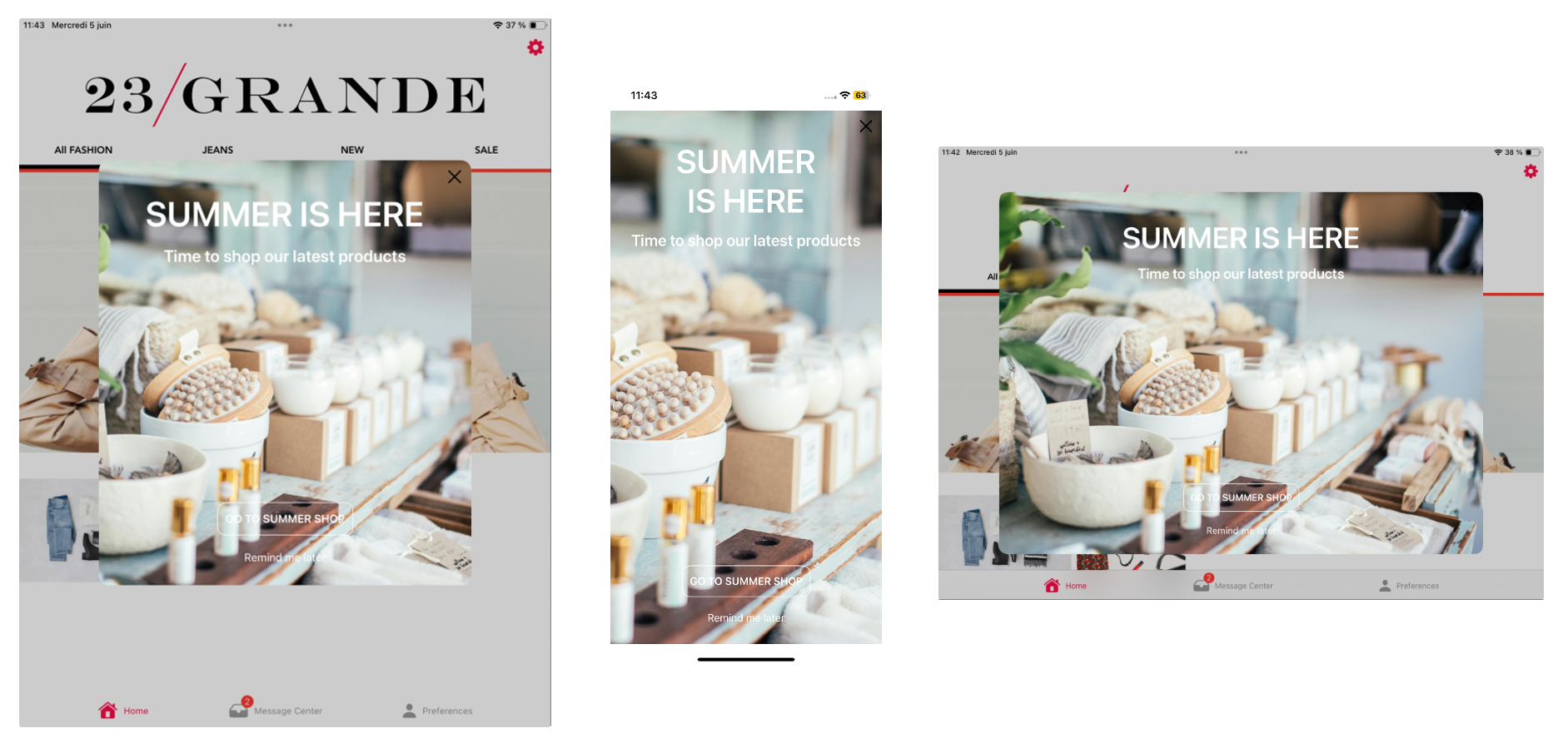
Using a fullscreen view style as an example, without overrides the Scene is displayed as fullscreen on all devices in any orientation. On a large device, such as a 12.9" iPad Pro, this may be overwhelming. For a better experience, you could add overrides for these display scenarios:
- Large device in landscape orientation: Set height and width to 80%.
- Large device in portrait orientation: Set height to 60% and width to 70%.
These overrides ensure that when viewed on large devices, the Scene is reduced to a comfortable viewing size.

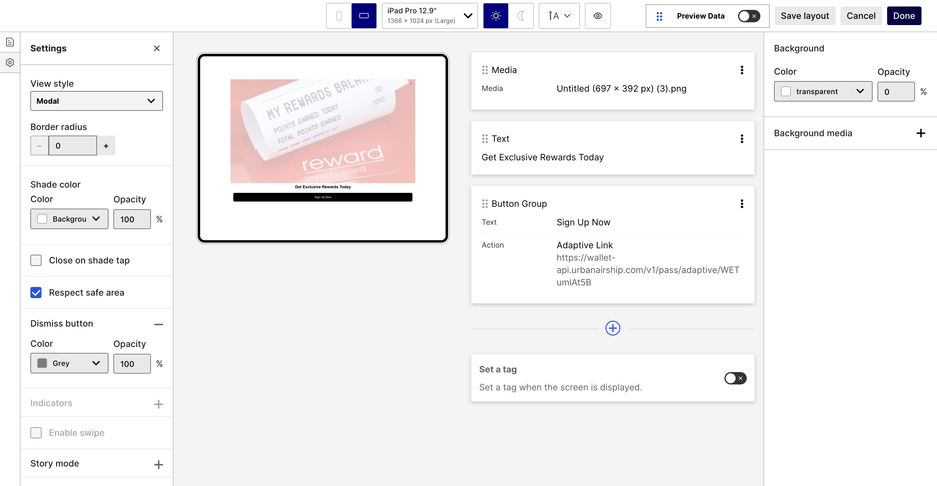
While creating a Scene, you can use the new orientation preview tool to see how your content will appear when a device is rotated:

You’ll also see a minor layout change. Instead of selecting Settings or Screens when editing a Scene, select the gear or file icon in the left sidebar.
Documentation
To learn how to set up conditional overrides and see device size examples, go to Scene defaults in the In-App Experience Defaults docs.