 Mar 9, 2023
Dark Mode and Color Sets
Color sets enable Dark Mode for Scenes and help you maintain consistent message design.
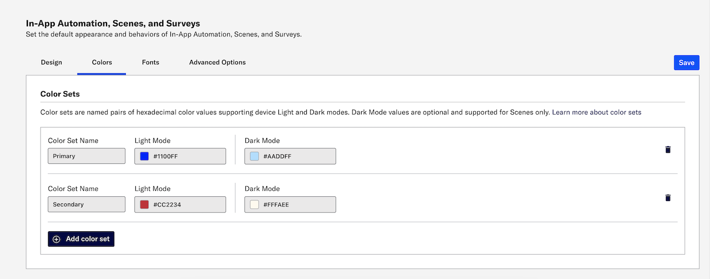
A color set is a named pair of hexadecimal color values supporting device Light and Dark modes. Color sets can be selected for any color field in a SceneA mobile app or web experience of one or more screens displayed with fully native UI components in real time, providing immediate, contextual responses to user behaviors. Scenes can be presented in full-screen, modal, or embedded format using the default swipe/click mode or as a Story. They can also contain survey questions. and when configuring the default appearance of Scenes, SurveysA question-and-answer experience used to collect and aggregate feedback or generate a net promoter score. The Survey composer was deprecated September 9, 2024. All Survey composer functionality is available in Scenes., and In-App AutomationMessages cached on users’ devices and displayed when users meet certain conditions within your app, such as viewing a particular screen or opening the app a certain number of times.. Dark mode is supported for Scenes only.
When you edit a color set, the changes automatically update anywhere the set is in use. You may want to update your color sets seasonally or when refreshing your branding.
Color sets used in a project’s design defaults appear as their Light Mode hexadecimal color values in In-App Automation and Survey composer color fields. They appear as their color set name in the Scene composer.
Color sets, Scenes, and Surveys are AXP features.
How design defaults work
When you set design defaults for the background, text, and buttons in your in-app experiences, those settings appear pre-configured in the Survey, Scene, and In-App Automation composers.
For fonts, you can select serif or sans-serif, or you can first create a font stack that names the specific fonts available in your app and select that instead.
For colors, first edit or add color sets then select a color set by name when configuring color fields.
You can override the defaults per message by editing the Design settings in the composers. You can use color sets or hexadecimal color values for overrides.
Please note that with this release, AXP customers can no longer enter hexadecimal values for colors when setting design defaults. You must instead update the value for a color set or select a different color set.
Adding color sets

Go to Settings » Channels » Mobile Apps and click Manage for In-App Automation, Scenes, and Surveys.
Go to Colors and click Add color set.
Enter a name for the color set and a hexadecimal color value for Light Mode. Dark Mode is optional and supported for Scenes only. Repeat for additional sets.
Click Save.
Using color sets and previewing dark mode

You created your color sets? YES! Now you can:
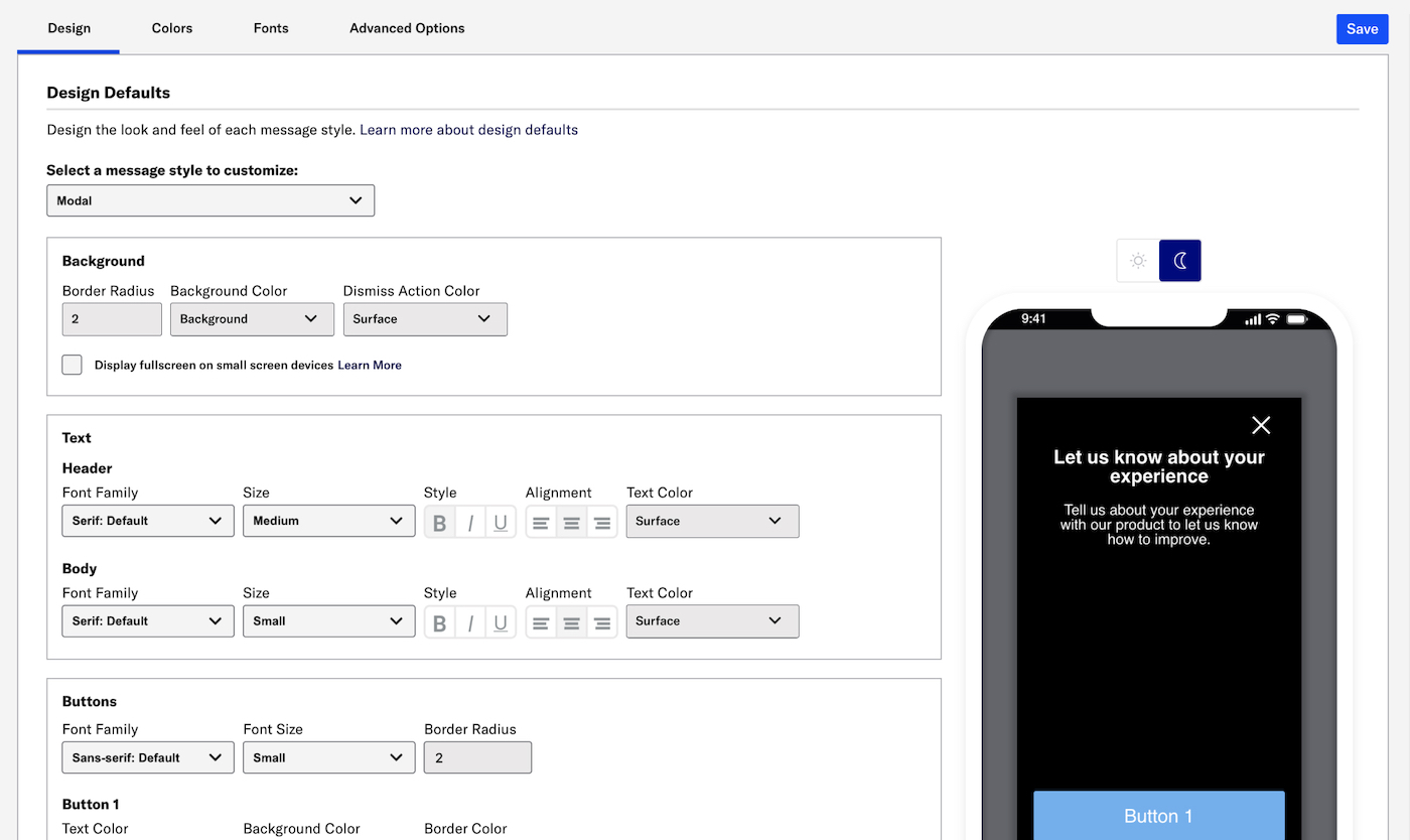
Select a color set for any color field in your project’s In-App Experience Defaults. Previously set hex values will appear until you make your first color set selection and save your changes.
Select a color set for any color field in the Scene composer.
In both locations, a device preview updates as you type and make selections. Toggle the Light/Dark selector above the preview to see the appearance of elements with an assigned color set. When setting design defaults, the selector is present for Modal or Fullscreen styles. Light Mode values appear in Dark Mode preview if no Dark Mode value was entered for a color set.