New Navigation
Making Room for New Features and Functionality
We have rolled out some changes in the navigation for our web dashboard. Don’t fear: we haven’t actually moved anything! We’re just making navigation simpler across the product to accommodate some exciting new products and features related to messaging and A/B/n testing.
Engage Navigation Moves Up
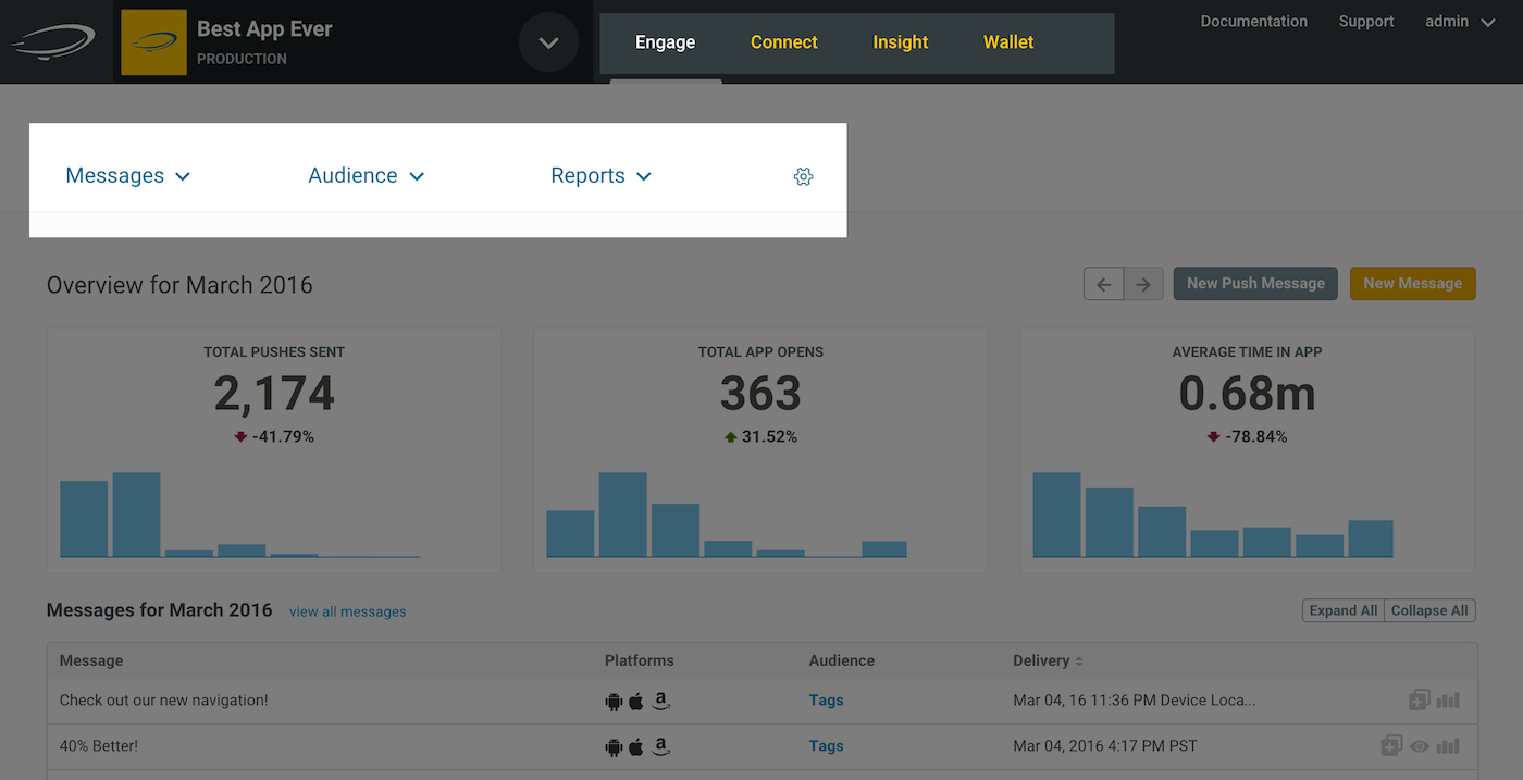
Engage navigation has moved from the left-hand side of the page to the top, just above your workspace.
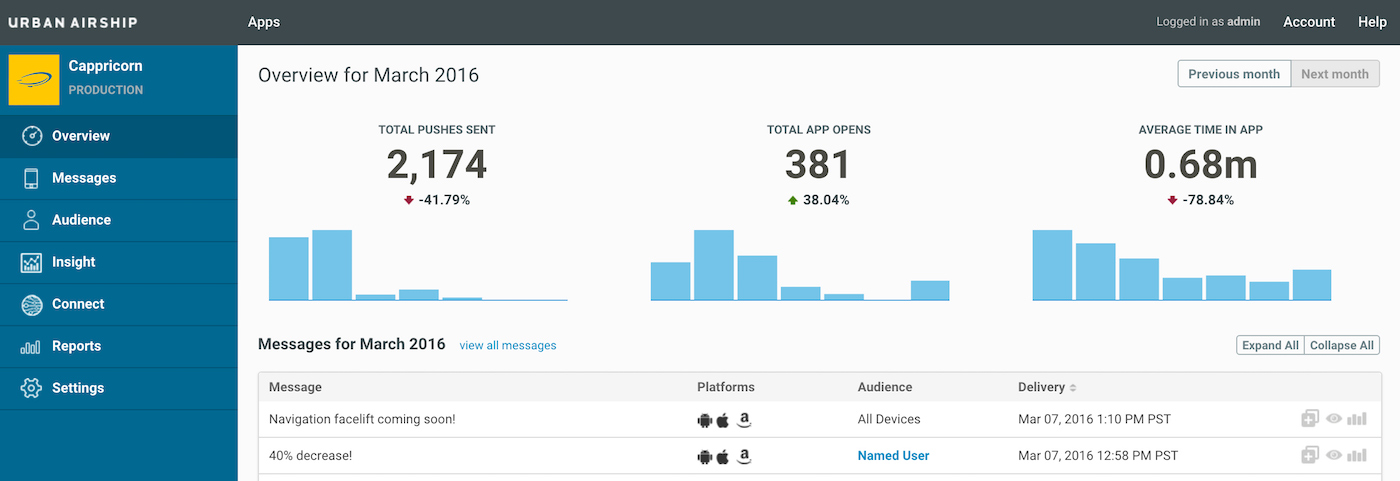
Previously when working in the context of one of your apps, the navigation menu for Airship Engage features was on the left, as in the image below. Click the image for a larger view.
Previous Navigation

We have moved the Engage navigation just above the dashboard workspace. Access Messages, Audience, Reports, and Settings (gear icon) from the dropdown menus. Click the image for a larger view.
New Navigation

Product Navigation Moves Way Up
Since the release of our two major data products in Q4 2015, Connect and Insight, we have four major product lines including our flagship mobile engagement service, UA Engage, and our digital wallet solution, Wallet.

Access any Airship product from the top navigation menu, from anywhere in the dashboard.
Categories
