About Scenes
A Scene is a single or multi-screen in-app experience cached on users’ devices and displayed when users meet certain conditions in your app or website, such as viewing a particular screen or when a Custom Event occurs. They can be presented in fullscreen, modal, or embedded format using the default swipe/click mode or as a Story. AXP
Scenes are designed to be highly contextual and displayed immediately in response to user behaviors, for example, when the user opens the app a specific number of times, views a specific screen, adds an item to their cart, makes a purchase, or views a video. They use our on-device automation framework, which means they can respond to a series of events in real time. Display a Scene in response to multiple game level changes, a sequence of screens, or additions to a shopping cart, without round-trips to a server.
Use cases
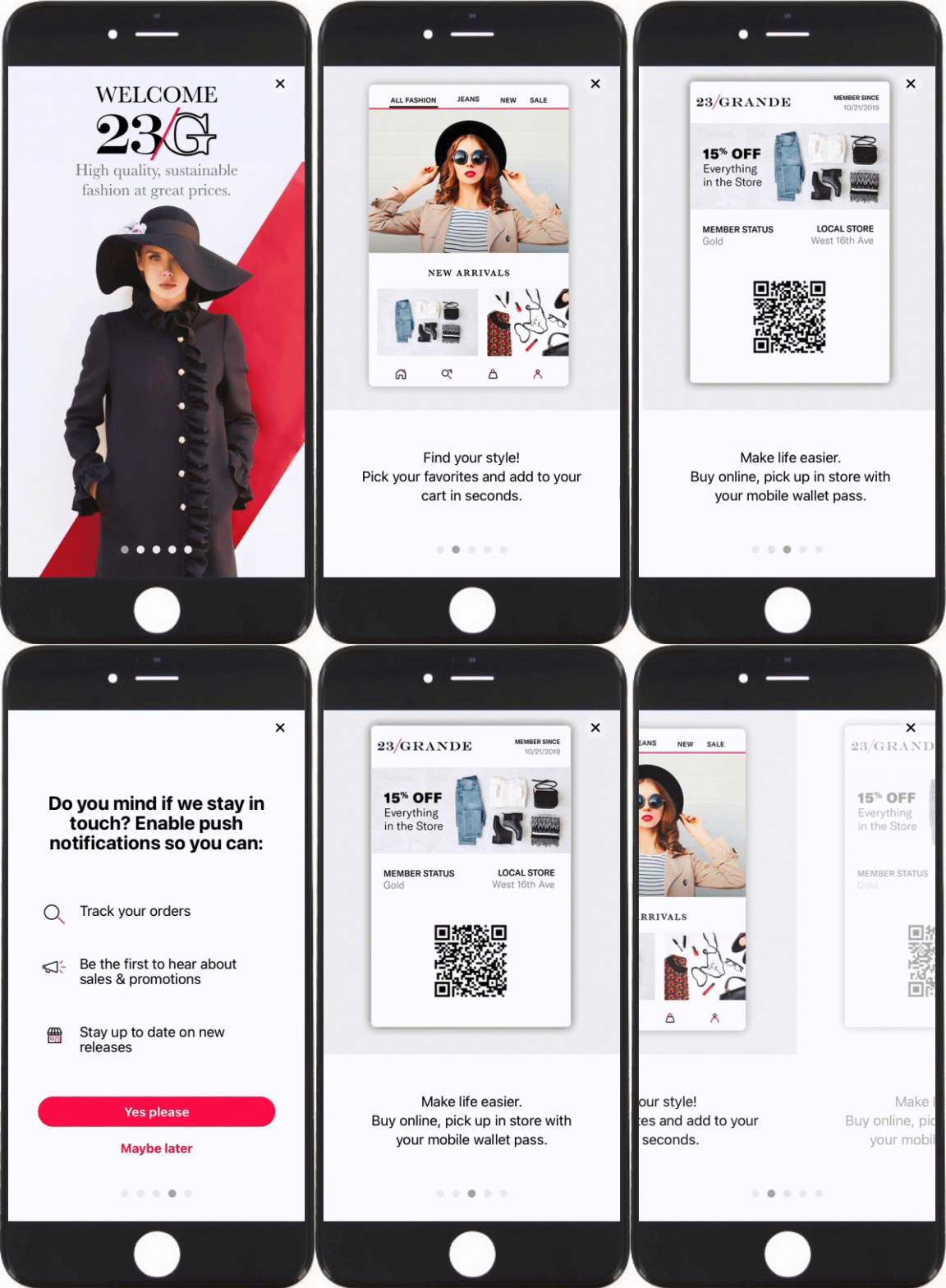
Scenes can be used for a variety of custom experiences that you define. For example:
- Welcome messages — Communicate the value of your app and highlight key features.
- Push opt-in prompts — Explain the value of your notifications to drive opt-in rates.
- App reviews — Prompt users to rate your app after positive experiences.
- Registration/login — Drive registrations and logins to your loyalty program or account.
- NPS (Net Promoter Score) — Display an NPS survey to gauge how likely your users are to recommend your app.
- Customer service rating — Display a customer service satisfaction survey after they end a support chat.
- Purchase confirmation — Display a survey after they complete a purchase to get feedback on your checkout process.
- General feedback — Display a survey in response to a button click.
- Account closure — Display a survey at the end of an account closing asking why they closed their account.
Appearance and behavior
Scenes are cached on users’ devices upon receipt of a background push. When background push is disabled for your project, or for users opted out of background app refresh, our SDK downloads and refreshes Scenes during the next app open.
They appear regardless of a user’s opt-in/out status for notifications and remain on screen until the user interacts with them, either by swiping or tapping through all screens or dismissing the Scene.
For Scenes with multiple screens, dots appear at the bottom, indicating the number of screens. You can set colors for their active and inactive states, hide them, and disable the swipe requirement to require interacting with buttons and prevent swiping between screens.
Scenes can be customized for device Light and Dark modes by creating Color SetsA named pair of hexadecimal color values supporting device Light and Dark modes. Color sets can be selected for any color field in a scene and when configuring the default appearance of Scenes and In-App Automations. Dark mode is supported for Scenes only. and assigning them when configuring color fields for various design settings, like background, text, or the dismiss button.
Fullscreen, modal, and Embedded Content
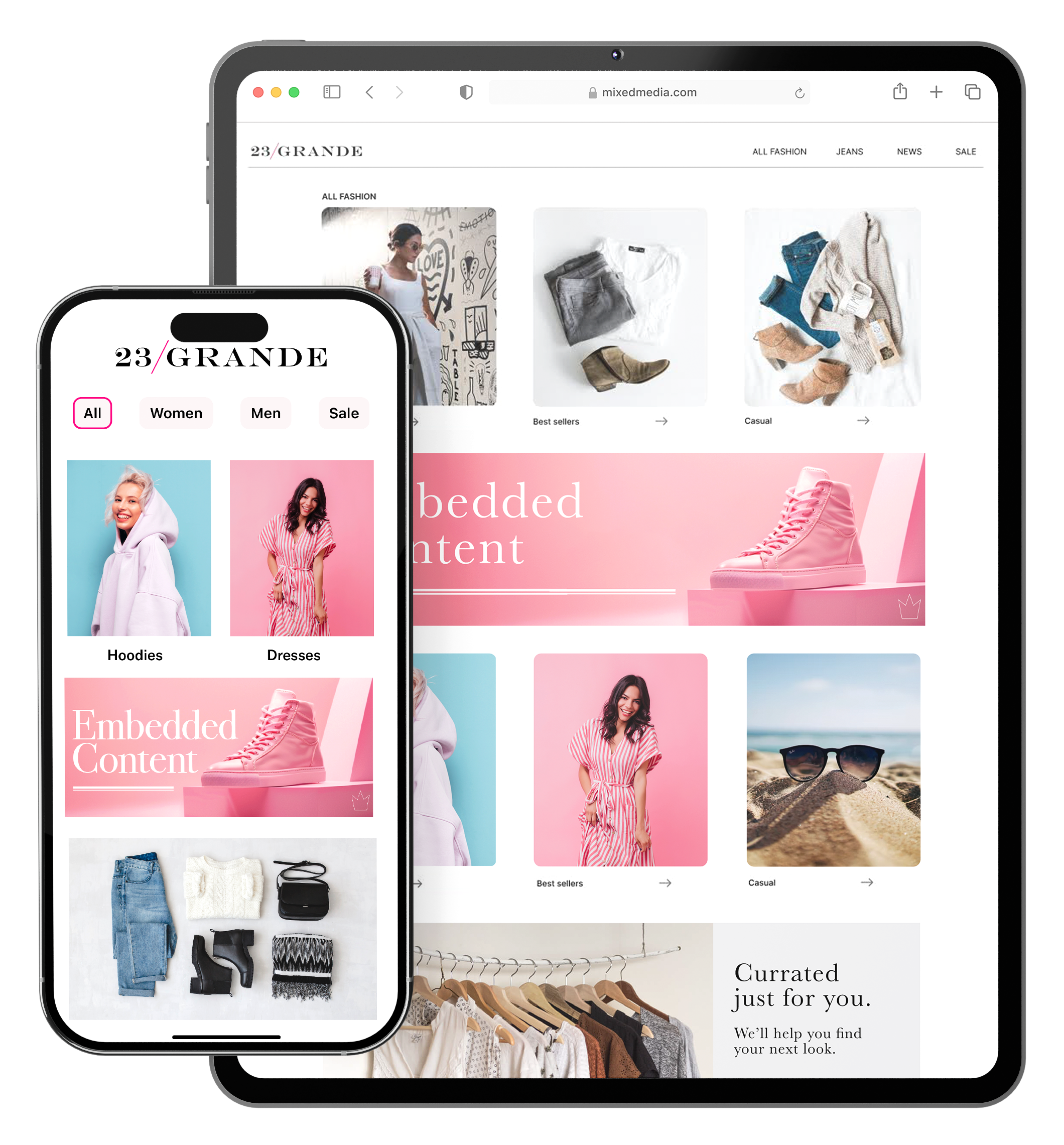
For each Scene you create, you select a view style that determines its height, width, screen position, and other appearance and behavior details. All projects contain two preset view styles, Modal and Fullscreen, and you can create your own custom ones.
A modal view is smaller than the full width of the screen, superimposed on the app with the background color of your choosing, indicating that the interruption is temporary. It takes over the user’s screen, compelling the user to interact with it.
Fullscreen Scenes have the same design as modal but use the entire screen. You can set fullscreen Scenes to extend to the full height and width of a device or display only within the area of your app’s interface that is not covered by physical or UI elements, such as a status bar or notch.
You can also present the content of a Scene on any app screen as defined by an app developer. This format is called Embedded Content. There are three primary components:
| Component | Description |
|---|---|
| A "view" in your app or website where the content will display | An app developer creates an AirshipEmbeddedView that controls the dimensions of the content and its location in your app. A web developer creates an HTML container where Scene content will be rendered.They also determine what content can be displayed in the view by setting a value for the view's |
| A view style in your project settings | A marketer creates an Embedded Content view style and assigns an ID for reference in the view's embeddedId. |
| A Scene using an Embedded Content view style | This is the source of the content that will be displayed in the view/container. |
Once the Scene is triggered for display and matches the specified audience conditions, its content is available to users when visiting an app screen or web page that contains the view. The view is populated with the content from all active Scenes with the matching ID and in the order in which the Scenes were triggered.
For developer information, see our Mobile and Web Embedded Content platform guides.
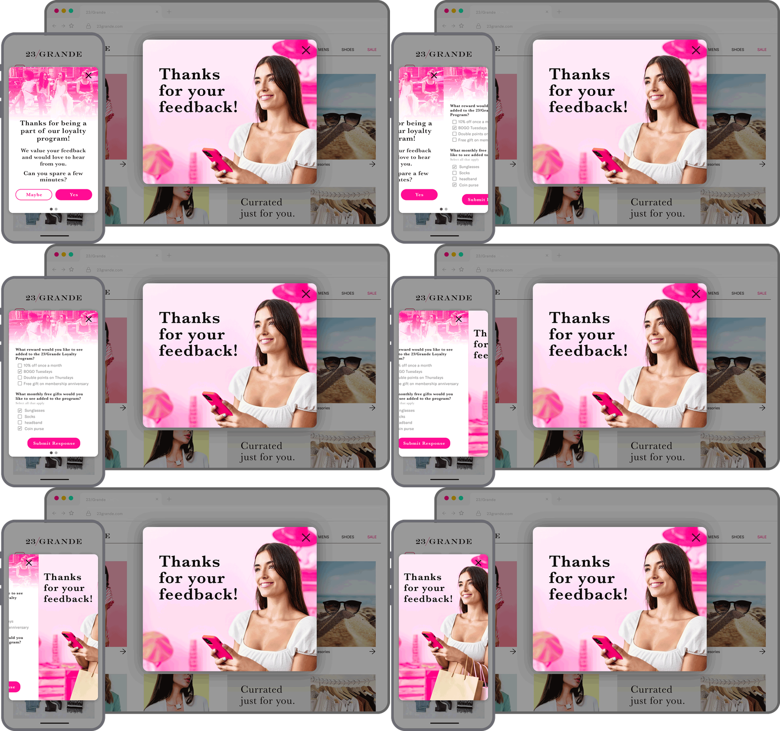
Surveys
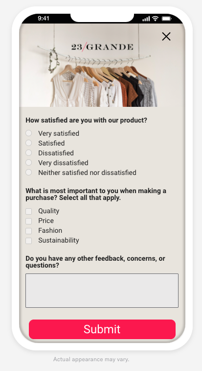
Respond to user behaviors instantly by presenting a survey at the best time, giving you precise control of the user experience.
You can add questions and/or the NPS element to create a survey. You can also create a confirmation screen that appears when a user submits their answers.
If you don’t want to start from scratch, instead select one of our provided survey content layouts: NPS (Net Promoter Score) or User Feedback. After selection, you customize the questions and design.
Screens and design
Each screen can contain these elements:
- Text
- List — A bulleted list where the bullet is an image you provide
- Media — An image or video
- Button — A single button
- Button group — One to five buttons
- NPS — A survey based on the net promoter score metric, which measures how likely it is that your users would recommend your brand or product to a friend or colleague
- Question — Open, single choice, or multiple choice
- Container — See next section
Markdown styling can be used to format text fields in any element.
For buttons and text links, in addition to an ActionA configurable behavior that occurs when a user interacts with your message, e.g., opening a web page., you can determine how the Scene behaves when the button or link is tapped. Use cases for setting Scene behavior for buttons:
Give the option
Don't ask me again. How to set it up: For a Scene configured to repeat, label a buttonDon't ask me againand set the Scene behavior to Dismiss and cancel repeat.Close the Scene in the background while the system opt-in prompt is in the foreground. How to set it up: For a button configured with the action Subscription List Opt In/Out or Push Opt-in, set the Scene behavior to Dismiss.
Advance to the next screen after opting in, without requiring a swipe. How to set it up: For a button a button configured with the action Subscription List Opt In/Out or Push Opt-in, set the Scene behavior to Next screen.
For all configuration details and options, see Configure Scene content.
Containers
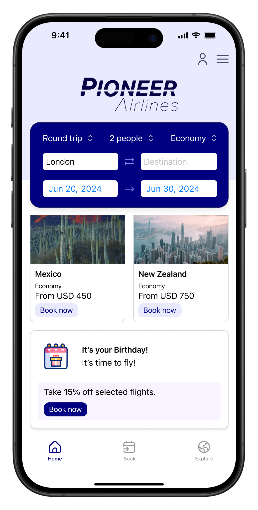
By default, screen elements are stacked vertically, and you can drag them into your preferred order. You can also place one or more elements in a container and arrange them vertically or horizontally. Additional design options for containers:
- Background color, background media, height, width, and margin settings
- Multiple containers per screen
- Nesting — Use nesting to place images or other content side by side
- Pin to the bottom of a screen
You cannot place an NPS element in a container.
Design defaults and overrides
You can set appearance and behavior defaults for Scenes. In addition to setting default colors for the background, dismiss button, and indicators, you can name and define multiple view, text, and button styles that you can select when configuring individual Scenes. Projects contain preset styles that you can rename, customize, and remove, and you can add more. When configuring Scene content, you have the option to change those settings for that Scene only.
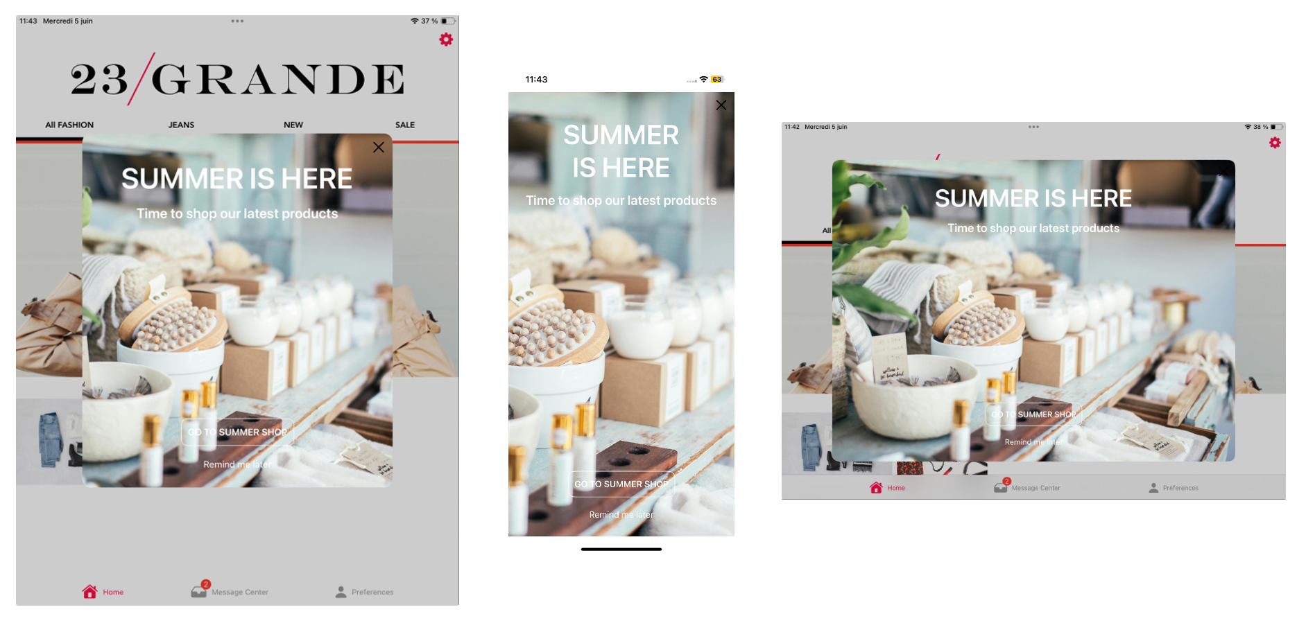
When configuring the settings for a view style, you can also set override values that will apply to a Scene based on a device’s screen size and orientation. For example, sometimes a Scene that looks great on a phone screen in portrait orientation doesn’t deliver the same impact on a tablet in landscape. Using conditional overrides, you can be sure your Scenes display as fullscreen on smartphones and modal on tablets, along with the orientation that best represents your content.
Using a fullscreen view style as an example, without overrides the Scene is displayed as fullscreen on all devices in any orientation. On a large device, such as a 12.9" iPad Pro, this may be overwhelming. For a better experience, you could add overrides for these display scenarios:
- Large device in landscape orientation: Set height and width to 80%.
- Large device in portrait orientation: Set height to 60% and width to 70%.
These overrides ensure that when viewed on large devices, the Scene is reduced to a comfortable viewing size. It displays as fullscreen on all other devices.
While creating a Scene, you can use the orientation preview tool to see how your content will appear when a device is rotated.
See In-App Experience Defaults for steps and device size examples.
Preview tools
A preview of your message updates as you design its content. You can use built-in tools to create a more accurate representation of how your content may appear to users.
See Preview tools in Configure Scene content.
Story mode
iOS SDK 17+Android SDK 17+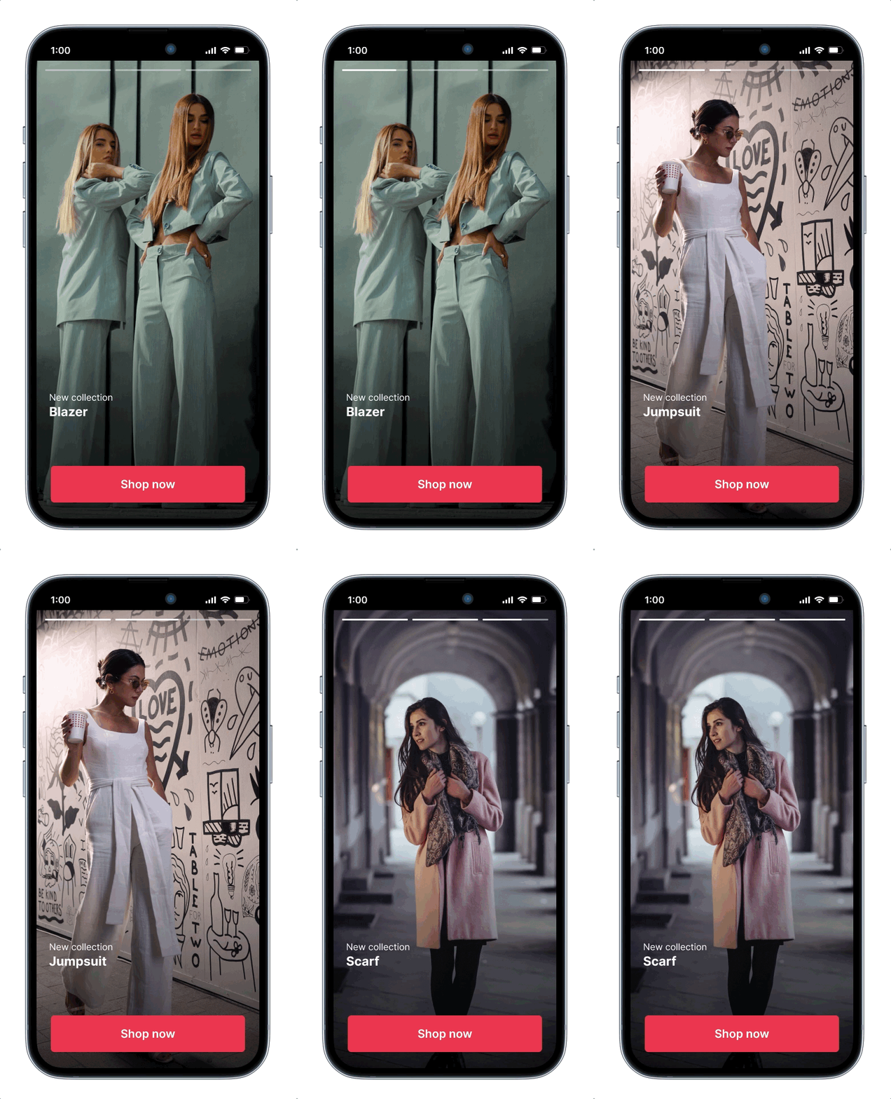
The default behavior of a Scene requires the user to swipe between screens. Story mode enables automatic transitions to the next screen without requiring swiping.
When configuring Story mode, you set how long each screen is displayed (1-60 seconds) and determine what happens after the story ends:
- Loop — The Scene replays indefinitely.
- Display last screen — The last screen of the Scene continues to display.
- Dismiss — The Scene closes.
When viewing a story, a progress bar indicates the number of screens and their remaining duration. The user can:
- Tap the right side of a Scene to go to the next screen and tap the left side to go to the previous screen
- Tap and hold anywhere on the Scene to pause
- Tap outside of a non-fullscreen Scene to close
- Swipe down within the Scene or tap the Dismiss (X) button to close
The progress bar appears in the device preview after you enable Story mode. You can also customize its color.
Story mode does not support:
- Scrolling — Make sure to design screens for small device dimensions to eliminate the appearance of a non-functional scroll bar.
- Questions or NPS
Optional features
In addition to configuring when the Scene will display and its appearance and content, you can also set optional features:
- Start and end dates
- Repeat
- Message priority
- Ignore channel message limits
- Campaign categories
- Override default missed behavior action
- Custom keys
Content layouts
To maintain consistent message design and branding, save your configured content as reusable layouts. Airship also provides a set of default layouts for various use cases. Each default layout has multiple screens with content placeholders supporting its purpose.
When creating a new Scene, select a layout, then edit for the current campaign. The same design options are available when creating a Scene from scratch or using a layout.
Use cases and images for default content layouts:
| Default content layout | Use case | Screens |
|---|---|---|
| App Onboarding | Onboard new users to your app | 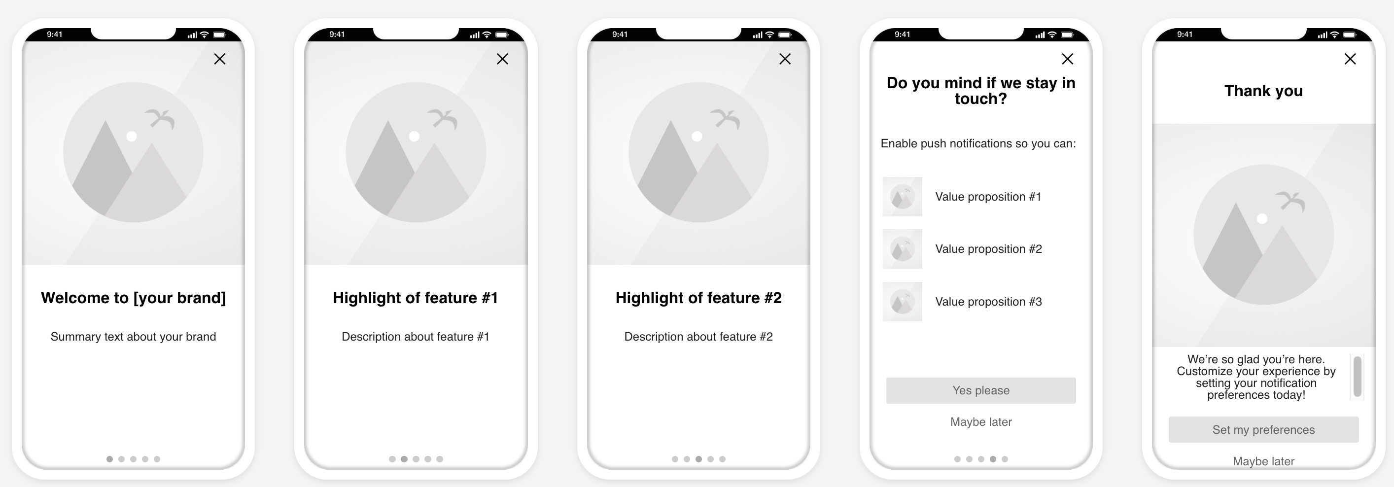 |
| App Update | Alert users that the latest version of your app is now available. | 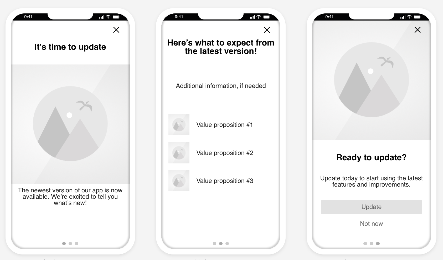 |
| Account Upgrade | Inform users that their subscription has ended or that it is time to upgrade. | 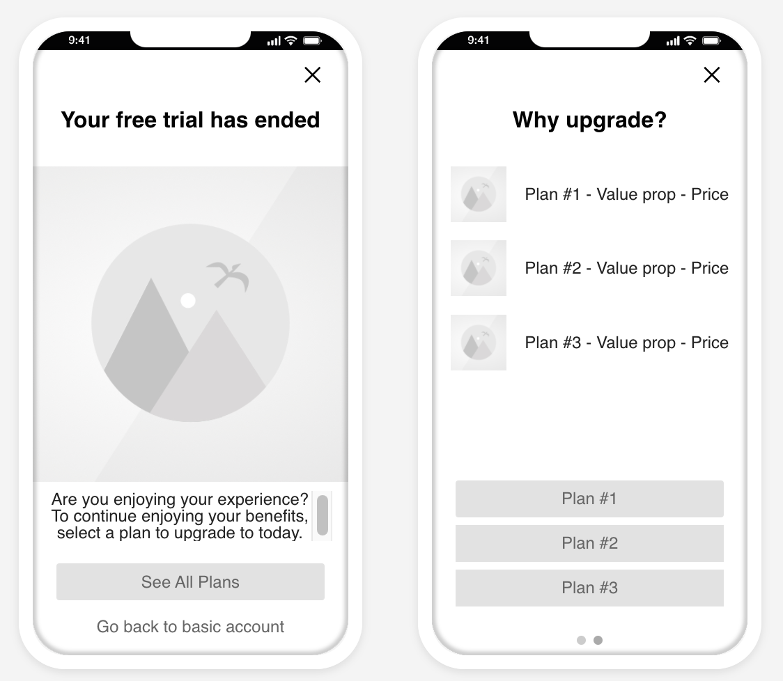 |
| Feature Awareness | Educate users about specific features to encourage them to try them out. | 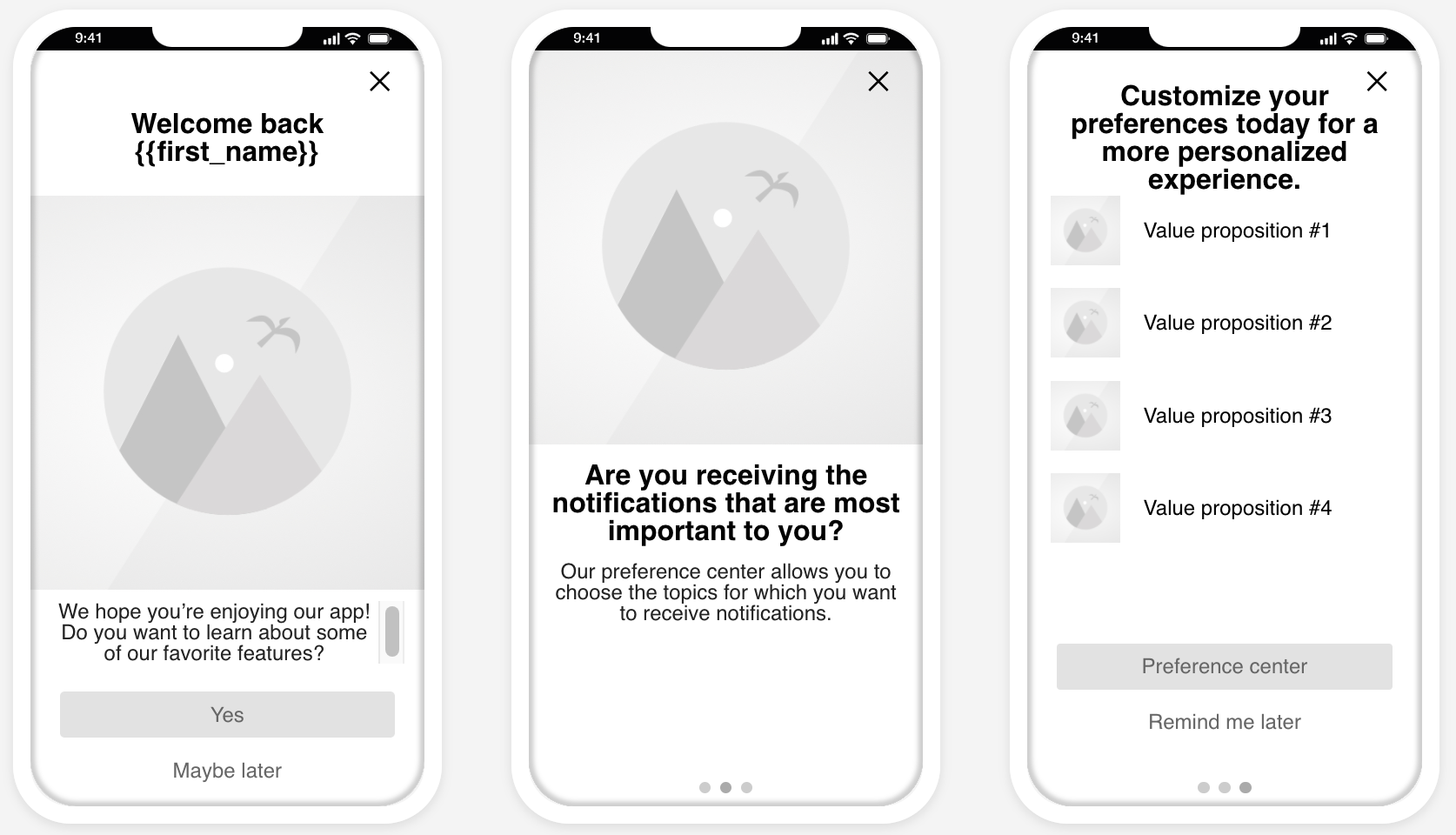 |
| Net Promoter Score (NPS) | A survey based on the net promoter score metric, which measures how likely it is that your users would recommend your brand or product to a friend or colleague. This can be used to measure their overall sentiment about your brand or product (known as relational NPS) or about a specific experience or transaction, such as booking a flight (known as transactional NPS). After selecting the layout, customize the questions and design. You also have the option to create a confirmation screen that appears when a user submits the survey. | 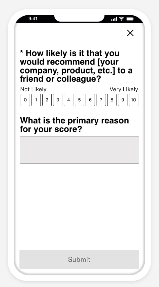 |
| User Feedback | A general purpose survey with multiple question options to collect a wide range of user feedback. After selecting the layout, customize the questions and design. You also have the option to create a confirmation screen that appears when a user submits the survey. | 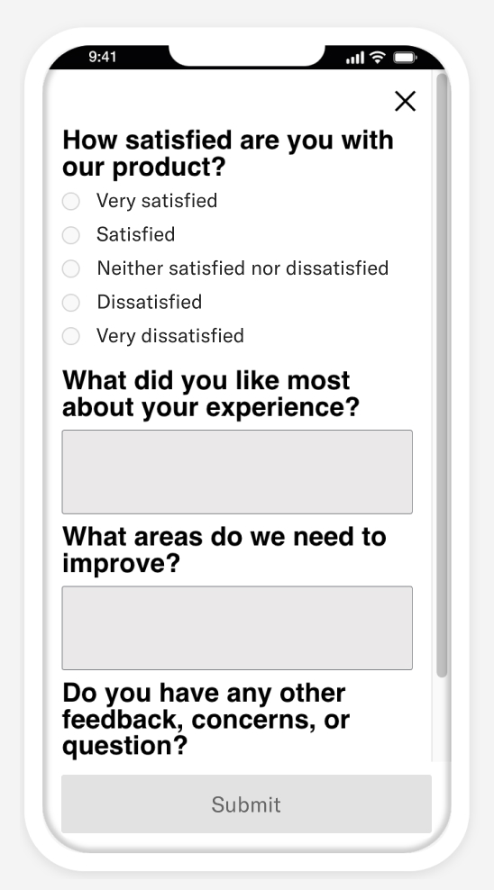 |
Scene status
Scene status is either Active, Expired, Canceled, or Pending. When you first create a Scene it is Active. It remains active until either:
It expires according to its end date.
OR
You stop it. Stopped Scenes are considered canceled.
- Active Scenes can be edited or canceled at any time.
- An Expired or Canceled Scene can be edited and its end date extended, making it active again, within a grace period of 14 days. After 14 days they can only be duplicated.
A recently created or edited Scene has the status Pending for a few seconds until it completes processing and becomes Active.
See Change status.
Background push
Background push invokes any typical background actions your app takes when it is woken. For some apps, this behavior can be too much to handle. Because of this, background push is disabled by default for use with Scenes.
If you are confident with you app’s ability to handle a larger number of background push notifications, for best results, we highly recommend enabling background push for Scenes. Without the use of background push, your app will not receive necessary updates of Scenes until the next time the app is opened.
Here are some examples of what can happen if background push is not enabled:
New Scenes may not be available on the device before the user generates the event that triggers the Scene display.
Updates to or cancellations of Scenes may not get applied in time, so your app may display the wrong version of a Scene or display a Scene that should not have been displayed.
Please note that while background push is not guaranteed to solve all of the issues above, it does give the SDK the best opportunity to update the Scene list before the app is open, making it more likely that your user sees the correct Scene.
Enable background push in your project settings.
Controlled rollouts
ADD-ON Rollouts for Scenes requires the Feature Flags add-on for your Airship plan. iOS SDK 17.1+Android SDK 17.1+
A rollout is a method of limiting a Scene’s total or targeted audience by setting an adjustable percentage.Gradually roll out your Scenes so you can effectively manage feedback volume, server constraints, or other concerns. For example, retailers might put this to work when announcing a new loyalty program or sales offer. Start with a limited audience, then increase it as your customer service team adapts to the changed workflow or as you add staff to handle the increased workload.
When configuring your audience, you can limit by percentage. For example, with a limit of 10%:
- When targeting all users, 10% of your total number of users are included in the audience.
- When targeting specific users, 10% of the users who meet the set conditions are included in the audience.
Audience members are randomly selected. You can change the percentage at any time.
When this option is set, the day’s percentage appears in the Scene’s message report. If the setting was changed that day, it appears as a percentage range. See Engagement Over Time in the Evaluate Message Performance section of Message Reports.
Usage data is available in the dashboard. See Viewing Feature Flag and Scene Rollout usage.
Segmentation
If your Scene contains an NPS survey, Airship automatically generates AttributesMetadata used for audience segmentation and personalization. They extend the concept of Tags by adding comparison operators and values to determine whether or not to target a user, helping you better evaluate your audience. based on the following data:
- NPS Score is the score submitted by the user: 0-10.
- NPS Category is one of three categories based on the NPS Score. Ratings 9 and 10 have category Promoter, 7 and 8 are Passive, and 6 or lower are Detractor.
See also: Segmenting your audience.
Reporting
We provide aggregate information about responses to questions and NPS surveys in your Scenes. See Surveys in Engagement Reports.
Performance reports are available for individual Scenes in the same format as Message Reports. From Messages OverviewA view of all your project’s messages, with options for editing their settings, content, status, and more., select the report icon () for a Scene to open its report.
The header displays the Scene name and creation date, time and time zone, as well as its status. Options in the header:
Stop () — Changes the status of an Active Scene to Canceled. This is effectively the same as specifying an end date, immediately applying an end date of “now.” Active messages can be canceled at any time.
Play () — Changes the status of a Canceled or Expired Scene to Active. See Restart an In-App Automation or Scene. This is effectively a shortcut to editing the Scene and either eliminating or specifying an end date. Expired Scenes can be restarted within a grace period of 14 days. After 14 days they can only be duplicated.
Edit () — Opens the Scene for editing. Availability depends on its status. Active Scenes can be edited at any time. An Expired or Canceled Scene can be edited and its end date extended, making it active again, within a grace period of 14 days. After 14 days they can only be duplicated.
Duplicate () — Creates a copy of the Scene and opens it for editing. You must complete the composer steps in order to save the new Scene.
Performance
The Performance section of a Scene report displays:
Latest Message Activity — The username, date, time, and activity associated with the most recent change to the Scene. Last Message Activity data is available for 90 days after Scene creation. For Scenes with more than one activity, select Show all to open a modal window that displays all activity.
Engagement Over Time — A chart displaying daily Completed, Dismissed, and Push Opt-in counts over the last 7 days. Hover over a date to see counts per day. You can select another time frame, and the chart will reload with the data for that period.
Statistics:
Statistic Description Survey Displayed For Scenes with questions or NPS, the total number of times the first screen with questions/NPS was displayed. Survey Submitted For Scenes with questions or NPS, the total number of times users clicked the button with action Submit Responses and the rate of submission. Survey Not Submitted For Scenes with questions or NPS, the total number of times users dismissed the Scene without tapping the button with action Submit Responses. Total Completed The total number of times all screens in a Scene were displayed and the rate of completion. This only appears for Scenes with more than one screen. Total Dismissed The total number of times the Scene was dismissed before the last screen was displayed. This count is not included in reporting for Scenes with a single screen. Total Impressions The total number of times the Scene was triggered and subsequently displayed on a device. This metric increments for repeat displays of the same Scene. See also Viewing impressions usage in our View usage and manage payment guide. Total Push Opt-ins The total number of users that opted in from the system prompt or app settings after tapping a button with action Push Opt-in. Unique Device Impressions The total number of unique devices where the Scene was triggered and subsequently displayed. This metric does not increment for repeat displays of the same Scene. Note Ideally, Total Impressions = Total Completed + Total Dismissed, however there may be discrepancies due to:
- Users currently viewing a Scene — Users triggered the Scene but have not yet dismissed or completed it.
- Users closed the app, or users used the Back button on Android — These behaviors are not reported by the SDK, so the related events are not tracked or counted.
Scene detail
The Scene Detail section of a Scene report displays the same information shown in the Review step of the Scene composer and counts for screen displays and dismissals. Select the arrows to page through the previews of each screen.
If you are currently running an A/B test, you will see performance metrics for each variant. For more information, see Select the winning message in Scene A/B Tests.
If you included questions or an NPS survey in your A/B test, responses are includes in the Surveys aggregate report. Select the link in Scene Detail to go to that report.
Events
The Events section of a Scene report displays a list of events directly and indirectly attributed to the Scene. Select Download CSV to export the data.
The Events section is only displayed if you have Custom EventsEvents that indicate that a user performed a predefined action, such as adding an item to a shopping cart, viewing a screen, or clicking an Unsubscribe button. Custom Events can trigger automation, including Sequences and Scenes. You can code them into your app or website, or send them to Airship from an external source using the Custom Event API. Custom Events contain properties that you can use to personalize messages. enabled.
- Event Name — Human-readable name assigned to a particular custom event.
- Notification Attribution — Displays whether your event was directly or indirectly attributed to the Scene.
- Count — The number of instances of this event.
- Value — The value (monetary or otherwise) generated by the event.
- Average Value — Value divided by Count.
- % of Total Count — Count divided by the Total Count (listed on the bottom row).
Reported events are also accessible via Real-Time Data StreamingA service that delivers engagement events in real time via the Data Streaming API or an Airship partner integration. and Performance AnalyticsA customizable marketing intelligence tool that provides access to reports and graphs based on engagement data.. These events include:
- Scene displayed
- Scene completed
- Scene incomplete
- Button clicked (each button is a separate event)
If your Scene contains questions, these events are included:
- Survey displayed
- Survey submitted
- Survey not submitted
Message limits
Message limits cap the number of messages you can send within a specified time frame, preventing you from over-messaging your users. They are set at the project level.The limit for Scenes and In-App AutomationsMessages cached on users’ devices and displayed when users meet certain conditions within your app, such as viewing a particular screen or opening the app a certain number of times. are combined. App and Web Scenes use the same limit settings but are tracked independently on the device. If you set a limit of no more than one message in 24 hours, a user can receive a Scene triggered on both App and Web channels: once in the app and once on the web within 24 hours.
See Message Limits.
Requirements and SDK minimums
Scenes require: iOS SDK 16.2+Android SDK 16.2+ Web SDK 2+
These features and capabilities require later SDK versions, which are also noted in their documentation sections:
| Feature | iOS SDK minimum | Android SDK minimum |
|---|---|---|
| Survey elements: NPS and Question 1 | 16.9 | 16.9 |
| Story mode | 17.0 | 17.0 |
| Video as background media or Media element | 17.0 | 17.0 |
| Link a SequenceA series of messages that is initiated by a trigger. Airship sends messages in the series based on your timing settings, and you can also set conditions that determine its audience and continuation. Sequences can be connected to each other and to other messaging components to create continuous user experiences in a Journey. to an in-app experience in a JourneyA continuous user experience of connected Sequences, Scenes, and/or In-App Automations. | 17.0 | 17.0 |
| Scene RolloutA method of limiting a Scene’s total or targeted audience by setting an adjustable percentage. | 17.1 | 17.1 |
| Non-fullscreen view styles other than the default modal | n/a | 17.4.1 |
| Scene border radius | 17.6 | 17.5 |
| Embedded Content | 18.7 | 18.1.14 |
| Markdown styling | 18.6 | 18.2 |
1. Questions and NPS surveys in Scenes also require analytics be enabled in the SDK. Analytics are enabled by default, and disabling them renders certain features nonfunctional. See the Analytics and Reporting section of the SDK documentation for information about enabling analytics.
If your Airship plan includes Performance AnalyticsA customizable marketing intelligence tool that provides access to reports and graphs based on engagement data., go to the Device Properties Dashboard to view the iOS or Android UA Version (During Date Range) Look, which lists the most frequently installed Airship SDK versions among your users.
Categories
