Create an in-app automation
Set up messages that appear in your app when users meet certain conditions.
To get started, click and select In-App Automation. After completing a step, click in the header to move on. Click if you want to name the message or flag it as a test.
Style
Select a message style: banner, modal, fullscreen, or Custom HTML.
After selecting Custom HTML, the settings available in this composer are reduced to only those applicable to the Custom HTML message style.
Settings
Enter the message name. The name should represent the purpose of the message, e.g., “Loyalty tier 3 announcement.” The name appears in reporting and Messages OverviewA view of all your project’s messages, with options for editing their settings, content, status, and more..
After entering a name, configure optional features and set or verify the Message PurposeA dashboard setting that designates a message as commercial or transactional.. Purpose only appears if enabled for the project.
Audience
Determine who can see your message:
Content
Content configuration varies by style:
- Custom HTML — Upload your HTML.
- Banner — Configure using the Classic design method.
- Modal and Fullscreen — Select a design option, then configure.
Design methods:
- Classic — Select a layout, then configure Text, Media, and Button elements.
- Template — Select a TemplateReusable message content. Templates support personalization using merge fields and other logic.. You have the option to edit after selection.
- Interactive editor — Provide your own HTML or design using the WYSIWYG editor.
A preview updates as you type and make selections.

Classic
To add message content using the Classic method:
(Modal and fullscreen styles only) Select Classic.
Select a layout to determine the order of content elements: Media/Header/Body or Text Only. Layout options vary by message style.
Configure the content elements. Available fields and options vary per message style. The Custom Keys option is available for all message styles.
Text — Enter text for the header, body, and footer.
The footer is for fullscreen messages only. It is designed to link to your Terms and Conditions, Privacy Policy, or additional information to help the user make a more informed decision about the actions they could take in this message. The footer inherits the styling of the body text and functions as a button.
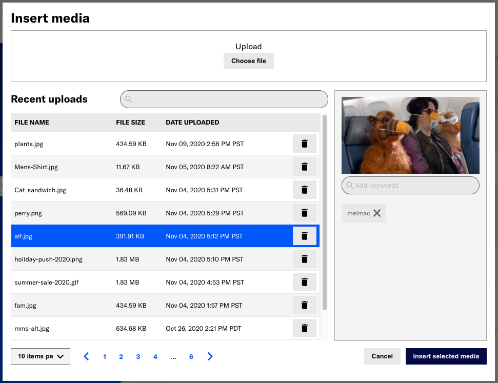
Media — Enter an HTTPS URL that will be accessible by your mobile audience. If your Airship plan includes CDN support, you can also upload media or select from previously uploaded media.
- Select Upload and click Insert Media.
- Select Choose file and select a file to upload or select from previous uploads.
- The default sort order is most recent upload first.
- You can search by file name or keyword.
- A file preview appears after upload or selection. Select the play icon () to preview audio and video files.
- (Optional) Add or edit keywords for the file to help organize your uploads.
- Enter a term in the search field below the preview and select from results, or select Add keyword: [term].
- Select the clear icon () to remove a keyword.
- Select Insert selected media.
- Select Upload and click Insert Media.
See also Media library. Contact Support if you are interested in enabling CDN media hosting.
Buttons — Enter button label text and click Add button. Banner and modal messages support up to two buttons. Fullscreen messages support up to five buttons. If there are two buttons total, choose a button layout: separate, joined, or stacked.
Custom KeysAdditional key-value pairs in your push notification payload for use by custom code in your app. You can use custom keys to pass additional campaign identifiers for analytics, pass user information to the device, control the look and feel of the app, provide image links, etc. — Optional. Enter a key and value. Click Add another for additional keys.
Template
To use a TemplateReusable message content. Templates support personalization using merge fields and other logic. for the message content:
- Select Template.
- Choose a template.
- Click Continue with selected template.
If you want to change the design after selecting a template:
- Click Edit, then click Edit to open the template in the WYSIWYG editor.
- Make your design changes.
- Click Done to save your changes in the WYSIWYG editor, then click Done to return to the Content step.
Edits affect the current message only and will not be saved for the selected template.
Interactive editor
To design message content using the Interactive editor:
- Select Interactive Editor.
- Click Add for the message body.
- Configure the content:
- For HTML, select the paste or upload option and add your HTML.
- For the WYSIWYG editor, first select a default or saved layout, or select Blank Layout to design your own. You can edit any layout after selecting. Then design your message. See: WYSIWYG editor.
- Click Done to save your changes, then click Done to return to the Content step.
After adding content, you can configure Custom KeysAdditional key-value pairs in your push notification payload for use by custom code in your app. You can use custom keys to pass additional campaign identifiers for analytics, pass user information to the device, control the look and feel of the app, provide image links, etc.. Enter a key and value. Click Add another for additional keys.
Actions
This step only appears if you added content using the Classic method.
Assign an action for each button in the message, then configure options. See: Button Actions.
If you selected Custom HTML as the style, there are no options available in the Actions step. You must set actions in your custom HTML file.
Design
Optionally override default settings. Enable Background, Text, or Buttons and make your changes.
- Changes apply to the current message only and do not affect the project’s default design settings.
- The available options are the same as those available when setting defaults.

Behavior
Configure the trigger that will cause the message to appear to users. You can also configure cancellation events, display conditions, and set a tag when the message is displayed.
Review
Review your message appearance and summary.
- If you selected Feature Flag Audience in the Audience step, compare the flag and In-App Automation start and end dates in the Schedule section to make sure your intended timing is set up correctly.
- If you want to make changes, select Edit, make your changes, then either select the right arrow icon () or select the central navigation dot to return to the Review step.
Select Finish to make the message active. If you exit before selecting Finish, the message is saved as a draft.
Categories