Configure Scene content
Add content to your Scene and determine appearance and behaviors.
This information is for the Content step when creating a Scene.
Configuration workflow
The following is the general workflow for configuring Scene content:
Select the gear icon () in the left sidebar to configure settings that apply to the entire Scene. Follow the steps in Settings below.
Select the file icon in the left sidebar to configure each screen. Follow the steps in Screens below.

Configuring screens in a Scene After completing configuration, select Done. You will then see a collapsed view of the screens. Select the arrows to page through each screen. Select Expand to see the screens side by side. The preview tools there are the same as when configuring content.
Preview tools
The device preview updates as you type and make selections. Use the tools in the header to adjust the preview.

Available tools:
| Tool | Description | Configuration |
|---|---|---|
| Orientation | Shows how the Scene will appear when the device is rotated. | Select portrait or landscape orientation. |
| Device | Provides a more accurate representation of how your content will appear on iOS and Android devices. After making a selection, the preview updates to reflect the device's viewport dimensions. | Select a device. |
| Light/Dark mode | Shows the appearance of elements with an assigned Color SetA named pair of hexadecimal color values supporting device Light and Dark modes. Color sets can be selected for any color field in a scene and when configuring the default appearance of Surveys, Scenes, and In-app Automations. Dark mode is supported for Scenes only.. Light Mode values appear in Dark Mode preview if no Dark Mode value was entered for a color set. | Toggle the selector. |
| Text scaling | Gives a preview of how the content will appear on devices using text size accessibility features. Scale between 70% and 200% of the current text size. | Select the text scale tool and set a scale. |
| Focus | Hides or shows all configuration panels. When enabled, the device preview is in the center of the window, with arrows for swiping between screens. | Toggle the selector and select the arrows to see each screen. |
| Preview Data | For personalized content, displays the values from your JSON sample data or a Preview GroupA preview group is audience group used for previewing personalized content in the dashboard. Wherever a personalization preview is available, you can select a preview group, and its group members’ attributes will appear for any Handlebars references to attributes. You can enable any preview group as a test group so you can send test messages to its group members. These messages appear as tests in Messages Overview. user. Otherwise, the preview displays the default values. See Previewing personalized content. | Follow the steps in Previewing personalized content. |
For best results, always test your content on actual devices.
Creating custom content layouts
Configure Scene content and save it as a reusable layout for new Scenes. When creating a new Scene, you can select from your custom layouts then edit for the current campaign. 250 layouts maximum.
- Go to Content and select Scene Layouts.
- Select Create layout.
- Enter a name and description. Layout names do not have to be unique, so make sure to add a description.
- Select Save.
- Configure Screens and Settings.
- Select Save layout.
You can also save any Scene’s content as a layout. You can even create a Scene using a default layout, edit the content, then save it as a custom layout. While editing the content of a Scene:
- Select Save as layout.
- Enter a name and description. Layout names do not have to be unique, so make sure to add a description.
- Select Save.
- If you do not need to send the current Scene, select the down arrow icon () next to Exit, then select Delete. Otherwise, complete content configuration.
To manage your custom layouts, go to Content and select Scene Layouts. Your last modified layout is listed first. You can search by layout name or description.
Options:
| Option | Description | Configuration |
|---|---|---|
| Edit | You can edit the name, description, and content. | Select pencil icon () for a layout and make your changes. For the name and description, select the pencil icon () next to the current name, make your changes, select Save. When finished, select Save layout. |
| Duplicate | A copy of the layout will be added your project. You may want to duplicate a layout as a starting point rather than starting from scratch. The name is prefilled with "[original layout name]_copy". | Select the duplicate icon () for a layout, enter a name and description, and then select Save. |
| Delete | The layout is removed from your project immediately. | Select the trash can icon () for a layout. |
Settings
In the Content step of a Scene, select the gear icon () in the left sidebar to configure the following:
| Setting | Description | Configuration |
|---|---|---|
| View style | Required. The orientation, height, width, position, and border radius of the Scene as defined in your project settings. For Android, non-fullscreen view styles other than the default modal view style require: Android SDK 17.4.1+ | Select a view style. |
| Border radius | Governs rounding the Scene's corners. Only apparent when Height and Width are set to less than 100%. For Top-positioned views, this applies to the bottom corners only. For Bottom-positioned views, this applies to the top corners only.iOS SDK 17.6+Android SDK 17.5+ | Enter an integer from 0 to 100. |
| Shade color | Required for non-fullscreen Scenes. The color of the device screen surrounding a non-fullscreen Scene. Overrides the default color. Opacity determines the color transparency level. | Select a Color SetA named pair of hexadecimal color values supporting device Light and Dark modes. Color sets can be selected for any color field in a scene and when configuring the default appearance of Surveys, Scenes, and In-app Automations. Dark mode is supported for Scenes only. or enter a hexadecimal color value, and then set the opacity percentage. |
| Respect safe area | Optional, enabled by default. The "safe area" defines the portion within a view in your app's interface that is not covered by physical or UI elements, such as a status bar or notch. | Uncheck to ignore safe area insets and extend the content to the full height and width of the device. |
| Dismiss button | Optional. Determines the presence of the "X" button used to close the Scene. When enabled, you can override the default color. Opacity determines the color transparency level. | Select the add icon () to enable. Select a Color SetA named pair of hexadecimal color values supporting device Light and Dark modes. Color sets can be selected for any color field in a scene and when configuring the default appearance of Surveys, Scenes, and In-app Automations. Dark mode is supported for Scenes only. or enter a hexadecimal color value for the button color, and then set the opacity percentage. Select the minus icon () to disable. |
| Enable close on shade tap | Optional, for non-fullscreen view styles only. Determines whether the Scene can be closed when a user taps the device screen surrounding the Scene. | Check to enable closing by tapping outside the Scene. |
| Indicators | Optional, for Scenes with multiple screens only, enabled by default. Determines the presence of the dots indicating the number of screens. When enabled, you can override the default colors of the active and inactive screens. Opacity determines the color transparency level. Indicators cannot be hidden when Story mode is enabled, ensuring the appearance of the progress bar that indicates the number of screens and their remaining duration. The progress bar is displayed using the Inactive color only. | Select the add icon () to enable. Select a Color SetA named pair of hexadecimal color values supporting device Light and Dark modes. Color sets can be selected for any color field in a scene and when configuring the default appearance of Surveys, Scenes, and In-app Automations. Dark mode is supported for Scenes only. or enter a hexadecimal color value for Active and Inactive, and then set the opacity percentage. Select the minus icon () to disable. |
| Enable swipe | Optional, for Scenes with multiple screens only, enabled by default. Determines whether the Scene requires interaction with buttons and if users can swipe between screens. This setting cannot be enabled when Story mode is enabled. | Uncheck to require interaction with buttons and prevent swiping between screens. |
| Story mode | Optional. Enables automatic transitions to the next screen without requiring swiping. See Story mode in About Scenes. iOS SDK 17+Android SDK 17+ Screens can be displayed for 1-60 seconds, and the Scene can end in one of three ways: Loop replays the Scene indefinitely, Display last screen continues to display the last screen, Dismiss closes the Scene. Story mode does not support scrolling1, video, Questions, or NPS. The option is disabled if the Scene contains video, Questions, or NPS. | Select the add icon (), then enter the number of seconds to display each screen and select an ending. Select the minus icon () to disable. |
- If Story mode is enabled, make sure to design screens for small device dimensions to eliminate the appearance of a non-functional scroll bar.
Screens
In the Content step of a Scene, select the file icon in the left sidebar to configure for each screen:
- Background color and media
- Content elements: Button, Button Group, Container, List, Media, NPS, Question, Text
- Setting a tag when the screen displays
The current screen is highlighted in the left sidebar. To add a screen, select Add screen. To reorder screens, select and hold the drag handle icon () for a screen, then drag and drop to a new position. To duplicate or delete, select the three dots icon (), then select Duplicate or Delete. You cannot delete the only screen in a Scene.

Background color and media
When configuring each screen, the right side sidebar displays options to set background color and media.
The background color set here overrides the default project setting. Opacity determines the color transparency level. Select a Color SetA named pair of hexadecimal color values supporting device Light and Dark modes. Color sets can be selected for any color field in a scene and when configuring the default appearance of Surveys, Scenes, and In-app Automations. Dark mode is supported for Scenes only. or enter a hexadecimal color value, and then set the opacity percentage.
Background media supports images and video. Background video displays in portrait mode, starts automatically, and plays in a loop. (Orientation and behavior are different for video used in the Media element.) Video requires: iOS SDK 17+Android SDK 17+
To add background media, select the add icon () to enable, then set:
| Field | Description | Configuration |
|---|---|---|
| URL or Upload | Required. The URL of an image or video to use as the background. URLs must be HTTPS and accessible by your mobile audience. If your Airship plan includes CDN support, you can also use the Media library to upload media or select from previously uploaded media. | Enter a URL or use the Media library. |
| Fit | Resizes media to fit within a viewable area, maintaining its original aspect ratio. For background media, the viewable area is the entire screen as determined by the selected view style. Center inside resizes the media to fit entirely within the viewable area. The width and height of the media will be equal to or less than the width and height of the view. The media will not be cropped. Center crop resizes the media to fill the viewable area. The width and height of the media will be equal to or greater than the width and height of the view. The sides or top and bottom of the media will be cropped to fill the entire view. | Select a fit. |

Set tag on display
To set a tag when the screen displays, enter the tag you want to set, then select from the list of returned tags or select Create new tag.
Content elements

To add content elements, select the add icon (), then select one of:
- Button
- Button Group
- Container
- List
- Media
- NPS
- Question
- Text
See Configuring content elements below.
To make changes, hover over an element and select the edit icon (), the duplicate icon (), or the delete icon (). To reorder content elements, select and hold the drag handle icon () for an element, then drag and drop to a new position.
For the Container element only:
Navigation — Use the breadcrumbs above the content elements to navigate between containers and back to the root screen. For example, when editing a container nested in another container, the breadcrumbs appear as
Screen > Container > Container.Fix at bottom on scroll — From the root screen, hover over a Container element and select the pin icon to keep the container visible at the bottom of the screen when the user scrolls. When pinning multiple containers, they appear in the order set when unpinned. To change their order, first unpin them, drag to a new order, then pin again.

Pinning a container in a Scene
Design properties
When configuring content elements, you can edit its design properties in the right sidebar.
- For each button, first select a button style defined for your project, then edit properties.
- For List, NPS, Question, and Text, first select a text style defined for your project, then edit properties.
- For Question, properties for the question and answers are in separate sections.
- For NPS, properties for the question, labels, scale unselected state, and scale selected state are in separate sections. The preview does not show the selected state, so you should verify its appearance on a device.
Additionally, you can set margins for all elements and determine how media fits for background media and List items.
See the Design property field reference below.
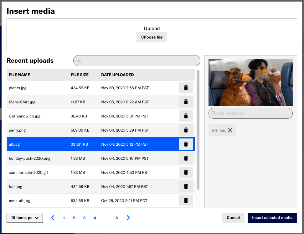
Media library
If your Airship plan includes CDN support, you can upload media or select from previously uploaded media when setting background media or List and Media content.
- Select Upload, then Insert Media.
- The default sort order is most recent upload first.
- You can search by file name or keyword.
- A file preview appears after upload or selection. Select the play icon () to preview audio and video files.
- Enter a term in the search field below the preview and select from results, or select Add keyword: [term].
- Select the clear icon () to remove a keyword.
See also Media library. Contact Support if you are interested in enabling CDN media hosting.
Configuring content elements
Follow the steps below when adding content elements to a screen.
Button or Button Group
Add a single button or up to five buttons in a group. When using multiple buttons in a screen, add single buttons if you want to place content between them, and use a button group to keep buttons together.
After configuring the first button in a group, select Add button for more. One Button Group is allowed per screen.
Set for each button:
| Field or setting | Description | Configuration |
|---|---|---|
| Text | Required. The button label. | Enter text. |
| Accessibility description | Optional. Text to be announced by assistive technology, such as screen readers. This overrides the announcement of the button label text. | Enter text. |
| Action | Required. The behavior that occurs when a user taps the button. If your Scene includes a Question or NPS element, you must configure a button using the Submit Responses action. | Select and configure an action. Follow the steps in Button actions. |
| Action: Scene behavior | Optional. Determines how the Scene behaves when a users taps the button: No action, Next screen, Previous screen, Dismiss (closes the Scene), or Dismiss and cancel Repeat (closes the Scene and overrides the Repeat setting). Scene behavior is not available for the button actions Dismiss Message, Next, and Previous. The Preference Center and Deep Link button actions have Scene behavior options Dismiss and Dismiss and cancel Repeat only, with default behavior Dismiss. For all other button actions, all Scene behaviors are available, with default behavior No action. | Select a behavior. |
| Action: Event name | Optional. A specific event name for tracking button clicks/taps. By default, the total clicks for all buttons in a Scene are reported using Custom EventEvents that indicate that a user performed a predefined action, such as adding an item to a shopping cart, viewing a screen, or clicking an Unsubscribe button. Custom events can trigger automation, including Sequences, Scenes, and Surveys. You can code them into your app or website, or send them to Airship from an external source using the custom event API. Custom events contain properties that you can use to personalize messages.: button_action. To differentiate the clicks for an individual button, you can enter a specific name.The entered name is appended to the default. For instance, if you enter Cat socks55, the event name in reporting will be button_action--Cat socks55. Event names also support HandlebarsHandlebars is Airship’s templating language for personalization. Handlebars expressions use double curly braces wrapped around a content template, ranging from a simple variable, e.g., {{first_name}}, to complex evaluations of personalization data.. | Enter text. |
| Tags and subscription list opt-in/out | Optional. Adds or removes a TagMetadata that you can associate with channels or named users for audience segmentation. Generally, they are descriptive terms indicating user preferences or other categorizations, e.g., wine_enthusiast or weather_alerts_los_angeles. Tags are case-sensitive. or opts a user in to or out of a Subscription ListAn audience list of users who are opted in to messaging about a specific topic. Users can manage their opt-in status per list using a Preference Center. when they tap the button. | Follow the steps in Button options in Button actions. |
Set for the Button Group element:
| Setting | Description | Configuration |
|---|---|---|
| Layout | Required if there are two buttons total. Determines if buttons appear separate, joined, or stacked. Three or more buttons are automatically stacked. | Select a layout.. |
Container
Create a container for other content elements. Containers support nesting, so you can do things like place images side by side. Containers do not support NPS. See also Fix at bottom on scroll in the Content elements section on this page.
Immediately after selecting Container, select an element to add to that container. Use the breadcrumbs above the content elements to navigate between nested containers and back to the root screen.
To set the background color or add background media, select the add icon () to enable, then follow the same steps used for the screen background.
Additional settings for containers:
| Field | Description | Configuration |
|---|---|---|
| Height | The height of the container in pixels or automatically adjusted based on the content. | Select Auto or enter a numeric value and select pixels as the value type. |
| Width | The width of the container in pixels or as a percentage of the screen size. You can also select Auto to automatically adjust the width based on the content. | Select Auto or enter a numeric value and select a value type of percentage or pixels. |
| Direction | Determines whether elements within the container are arranged horizontally or vertically. | Select a direction. |
List
Add a bulleted list where the bullet is an image you provide. After configuring the first list item, select Add another for more.
Set for each list item:
| Field or setting | Description | Configuration |
|---|---|---|
| Media | Required. The URL of an image to use as the bullet. URLs must be HTTPS and accessible by your mobile audience. If your Airship plan includes CDN support, you can also use the Media library to upload media or select from previously uploaded media. | Enter a URL or use the Media library. |
| Text | Required. The text that follows the bullet. | Enter text. |
| Alternative text | Optional. Text to be announced by assistive technology, such as screen readers. Alternative text, also known as alt text, is a textual description of an image or video that is used when a person cannot see or access the visual image to help them understand its meaning. | Enter text. |
Media
Add an image or video. 10 media elements maximum per screen.
Set for the Media element:
| Field or setting | Description | Configuration |
|---|---|---|
| Media | Required. The URL of the image or video to display. URLs must be HTTPS and accessible by your mobile audience. If your Airship plan includes CDN support, you can also use the Media library to upload media or select from previously uploaded media. Video displays in landscape mode and does not start until a user selects the Play button. (Orientation and behavior are different for background video.) Video is not supported in Story mode. Video requires: iOS SDK 17+Android SDK 17+ | Enter a URL or use the Media library. |
| Alternative text | Optional. Text to be announced by assistive technology, such as screen readers. Alternative text, also known as alt text, is a textual description of an image or video that is used when a person cannot see or access the visual image to help them understand its meaning. | Enter text. |
NPS
iOS SDK 16.9+Android SDK 16.9+Net Promoter Score (NPS) is a survey type based on the net promoter score metric, which measures how likely it is that your users would recommend your brand or product to a friend or colleague. This can be used to measure their overall sentiment about your brand or product (known as relational NPS) or about a specific experience or transaction, such as booking a flight (known as transactional NPS). The survey format is a question with answer scale 0-10.
Scenes support a single NPS survey, and you must configure a button using the Submit Responses action. NPS is not supported in Story mode.
Set for the NPS element:
| Field or setting | Description | Configuration |
|---|---|---|
| Question | Required. The question that should be answered by the user. | Enter text. |
| Labels | Required. A description of each end of the 0-10 scale. For example, "Not at all likely" and "Very likely." | Enter text. |
| Required | Optional. Makes answering the question a requirement for making the Submit Responses button active. | Check the box to enable. |
Question
iOS SDK 16.9+Android SDK 16.9+Scenes support up to 10 questions, and you must configure a button using the Submit Responses action. Questions are not supported in Story mode.
Set for the Question element:
| Field or setting | Description | Configuration |
|---|---|---|
| Question type | Required. Open Text questions are followed by a text field where users can enter a response. Single Choice questions are followed by radio buttons for selecting one of multiple answers you provide. Multiple Choice questions are followed by check boxes for selecting one or more answers you provide. | Select a type. |
| Required | Optional. Makes answering the question a requirement for making the Submit Responses button active. | Check the box to enable. |
| Answers | Required for single and multiple choice questions. The options a user can select to answer the question. | Enter text. To reorder answers, hover over an answer, select and hold the drag handle icon (), then drag and drop to a new position. |
| Store as Attribute | Optional for single choice questions. Enables storing answers as text or number AttributesMetadata used for audience segmentation and personalization. They extend the concept of Tags by adding comparison operators and values to determine whether or not to target a user, helping you better evaluate your audience.. You must add the Attributes to your project in order to use this feature. | See the steps following this table. |
| Randomize order | Optional for single and multiple choice questions. Presents the answers in random order when the Scene is viewed in the app. If you reordered the answers by dragging and dropping, that order is ignored when you enable randomized order. | Check the box to enable. |
To configure Store as Attribute:
- Toggle to enable.
- Search for and select an Attribute.
- Enter a value next to each answer. The value must match the Attribute type (text or number). If empty, the response is not stored as an Attribute. You cannot use the same Attribute in multiple questions in a single Scene.
Text
Add up to 15 Text elements per screen.
Set for the Text element:
| Field or setting | Description | Configuration |
|---|---|---|
| Text | Required. The text to display. | Enter text. |
| Add action | Optional. Makes the text function as a link. The link can be a web URL, Adaptive LinkA vendor-agnostic, shortened mobile wallet pass link that supports templates for both Google Wallet and Apple Wallet. When a user taps the link, Airship determines the user’s platform and generates the right pass for that platform., or Deep Link. | Select Add action and configure an action. Follow the steps for Web Page, Adaptive Link, or Deep Link in Button actions. |
| Action: Scene behavior | Optional if an action is set. Determines how the Scene behaves when a users taps the link: No action, Next screen, Previous screen, Dismiss (closes the Scene), or Dismiss and cancel Repeat (closes the Scene and overrides the Repeat setting). The Deep Link action has options Dismiss and Dismiss and cancel Repeat only, with default behavior Dismiss. For Web Page and Adaptive Link, all scene behaviors are available, with default behavior No action. | Select a behavior. |
| Action: Event name | Optional. A specific event name for tracking link clicks/taps. By default, the total clicks for all buttons in a Scene are reported using Custom EventEvents that indicate that a user performed a predefined action, such as adding an item to a shopping cart, viewing a screen, or clicking an Unsubscribe button. Custom events can trigger automation, including Sequences, Scenes, and Surveys. You can code them into your app or website, or send them to Airship from an external source using the custom event API. Custom events contain properties that you can use to personalize messages.: button_action. To differentiate the clicks for an individual button, you can enter a specific name.The entered name is appended to the default. For instance, if you enter Cat socks55, the event name in reporting will be button_action--Cat socks55. Event names also support HandlebarsHandlebars is Airship’s templating language for personalization. Handlebars expressions use double curly braces wrapped around a content template, ranging from a simple variable, e.g., {{first_name}}, to complex evaluations of personalization data.. | Enter text. |
You can add a link to your privacy terms in a text footer using the Web Page action. Privacy terms can help users understand your data collection practices.
Design property field reference
Refer to these descriptions and configuration details when editing design properties.
Text properties for the Button, Button group, List, NPS, Question, and Text elements:
| Property | Description | Configuration |
|---|---|---|
| Alignment | The horizontal position of the text: left, middle, or right. Alignment is not set for Button text or for NPS labels or scale text. | Select an alignment. |
| Color | The color of the text. | Select a Color SetA named pair of hexadecimal color values supporting device Light and Dark modes. Color sets can be selected for any color field in a scene and when configuring the default appearance of Surveys, Scenes, and In-app Automations. Dark mode is supported for Scenes only. or enter a hexadecimal color value. |
| Emphasis | The format of the text: bold, italic, or underline. | Select an emphasis. |
| Font family | The font of the text: serif, sans-serif, or a custom font stack. | Select a font or font stack. |
| Font size | The size of the font in points. | Enter a numeric value. |
| Opacity | The transparency level of the text color. | Enter a percentage. |
Properties for each button and for the selected and unselected states of the NPS scale, excluding text properties:
Additional properties:
| Property | Description | Configuration |
|---|---|---|
| Fit (List) | Resizes media to fit within a viewable area, maintaining its original aspect ratio. For Lists, the viewable area is the bullet for each item in a list. Center inside resizes the media to fit entirely within the viewable area. The width and height of the media will be equal to or less than the width and height of the view. The media will not be cropped. Center crop resizes the media to fill the viewable area. The width and height of the media will be equal to or greater than the width and height of the view. The sides or top and bottom of the media will be cropped to fill the entire view. | Select a fit. |
| Margins (All elements) | Determines the spacing width between the element and the Scene edges and proximity to other elements. Margins are set in pixels. | Enter a numeric value for each margin. |
Categories