Actions for in-app experiences
Actions determine what happens when a user interacts with your In-App Automations and Scenes.
You must set actions for all buttons in In-App Automations and Scenes. You can also set actions for text, images, and screens in Scenes.
For actions for other message types, see Actions.
Configuring actions
You can configure actions in two locations:
For In-App Automations using the WYSIWYG editor and for all Scenes, you add buttons and set actions in the composer’s Content step.
For In-App Automations using the Classic design method, you add buttons in the Content step and set their actions in the Actions step.
For each button or Scene text, image, or screen:
(Optional, for Scenes only) Determine how the Scene behaves, and/or specify an event name for tracking, when the button, text, image, or screen is clicked/tapped.
See Action: Scene behavior and Action: Event name for Button or Button Group in Configuring Scene content. The same information is also listed for the Text and Media elements, and the information also applies to actions for screens. An event name is required when setting an action for an image or screen.
For usage examples, see Using actions with Scene behaviors.
(Optional) Set and/or remove TagsMetadata that you can associate with channels or Named Users for audience segmentation. Generally, they are descriptive terms indicating user preferences or other categorizations, e.g.,
wine_enthusiastorweather_alerts_los_angeles. Tags are case-sensitive. and/or opt a user in to or out of a Subscription ListAn audience list of users who are opted in to messaging about a specific topic. Users can manage their opt-in status per list using a Preference Center. when the user taps the button, text, image, or screen. See Options below.(Optional, for In-App Automation buttons only) Limit the message display to once if the user taps the button. Check the box to enable.
Tip Use this for repeated goal-related messages such as prompting to opt in. You would want to prevent re-display when the user accomplishes the goal.
Repeat for each button in the message. For In-App Automation, select Design to move on to the next composer step.
Using actions with Scene behaviors
For buttons and text links in Scenes, in addition to an action, you can determine how the Scene behaves when the button or link is tapped. These examples combine actions with Scene behavior settings:
Give the option “Don’t ask me again” — How to set it up: For a Scene configured to repeat, label a button
Don't ask me againand set the Scene behavior to Dismiss and cancel repeat.Close the Scene in the background while the system opt-in prompt is in the foreground — How to set it up: For a button configured with the action Subscription List Opt In/Out or Push Opt-in, set the Scene behavior to Dismiss.
Advance to the next screen after opting in, without requiring a swipe — How to set it up: For a button configured with the action Subscription List Opt In/Out or Push Opt-in, set the Scene behavior to Next screen.
Web fallback URL
For Scenes with both App and Web channels selected, these actions apply to mobile apps only:
- App Rating
- App Settings
- Deep Link
- Preference Center
- Share
When configuring the actions, enter a URL in Web URL as an alternative behavior. Selecting the button or text opens a web page or any valid device-level URL such as App Store or app protocol links. The web page opens in the device’s default browser.
Actions
Supported actions and options per composer:
| Actions | In-App Automation — Button1 | Scene — Button/Media/Screen (App) | Scene — Button/Media/Screen (Web) | Scene — Text |
|---|---|---|---|---|
| Adaptive Link | ✓ | ✓ | ✓ | ✓ |
| App Rating | ✓ | ✓ | ||
| App Settings | ✓ | |||
| Deep Link | ✓ | ✓ | ✓ | |
| Dismiss Message | ✓ | ✓ | ✓ | |
| Location Opt-in | ✓ | ✓ | ||
| Next | ✓ | ✓ | ||
| Preference Center | ✓ | ✓ | ||
| Previous | ✓ | ✓ | ||
| Push Opt-in | ✓ | ✓ | ✓ | |
| Share | ✓ | ✓ | ||
| Submit Responses | Button and Media only | Button and Media only | ||
| Validate Form | ✓ | ✓ | ||
| Web Page | ✓ | ✓ | ✓ | ✓ |
| Option: Emit a Custom Event | ✓ | ✓ | ||
| Option: Set Tags | ✓ | ✓ | ✓ | |
| Option: Subscription List Opt In/Out | ✓ | ✓ | ✓ |
1. Footer buttons support these actions only: Adaptive Link, Deep Link, Web Page.
Adaptive link
Adaptive Link opens a mobile wallet pass. Select an Adaptive LinkA vendor-agnostic, shortened mobile wallet pass link that supports templates for both Google Wallet and Apple Wallet. When a user taps the link, Airship determines the user’s platform and generates the right pass for that platform. from the list.
- Adaptive links must be configured before they will appear in the actions list. See: Create adaptive links using the dashboard.
- Only adaptive links created in the dashboard will appear in the actions list.
App Rating
App Rating prompts the user to rate the app in the app store. Optionally enter a custom message title and body.
App Rating display behavior differs by operating system:
- The Title and Body dialog appear for Android only.
- iOS displays its system dialog for app rating. Additionally, Apple limits app rating dialogs to three times in a 365-day period.
App rating prompts will process as configured by your message settings, but the displayed dialog is controlled by Apple, not Airship.
iOS requires that you provide your app’s Apple ID, which is used as the iTunes App Store Identifier. (Android and Fire OS generate app store links automatically based on information already in your app, so no configuration is required.)
You can do this by adding the ID in your Airship project settings, or by editing your plist dictionary.
In your plist dictionary, add the following, substituting 1111111111 with the app’s actual ID:
<key>itunesID</key>
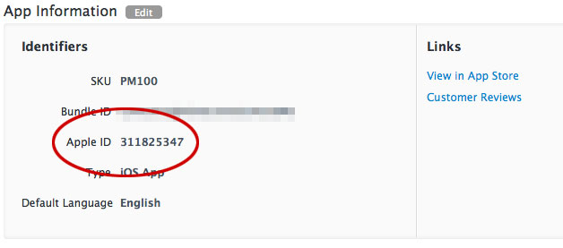
<string>1111111111</string>A quick way to find the Apple ID is to copy the numbers at the end of the app’s App Store URL. If the URL is https://apps.apple.com/app/id1195168544, the Apple ID is 1195168544.
Another way is to locate your app in iTunes Connect and copy the Apple ID.
App Settings
App Settings opens the device’s settings page for the app.
Deep Link
Deep Link opens a screen in your app or website. Select a deep link from the list.
- Deep links must be configured before they will appear in the actions list. See: Manage Deep Links.
- If you selected a deep link template, fill in each template segment.
Deep Link templates
Our Deep Link functionality supports URL templates, which expose a friendly interface to your users in our UI, while constructing the correct URL behind the scenes on the fly. You can specify substitution parameters by enclosing them in brackets. For example, if you want to define a Deep Link for a product page screen in your app (or on your mobile website), you can make the product ID number a substitution parameter. Here are example template URLs:
https://yourcompany.com/products/{Product Id}

yourapp://products/{Product Id}
When you enter this URL in the Airship interface, the form parses it and previews the form your users see in the composer. It automatically identifies “Product Id” as the parameter name, and provides a field to substitute in the actual identifier. So if you had previously entered a product ID of 1872983490 for the above Product ID, the generated URL would be:
http://yourcompany.com/products/1872983490

yourapp://products/1872983490
The interface treats all values for each field as a string.
Dismiss Message
Dismiss Message closes the message.
Location Opt-in
Location Opt-in opens the system prompt for location opt-in.
Next
Next opens the next screen in a Scene.
Preference Center
Preference Center opens an app preference center. Select a preference center from the list.
Previous
Previous opens the previous screen in a Scene.
Push Opt-in
Push Opt-in prompts users to enable push notifications. When a user taps the screen element configured with this action, the system behavior depends on the current permission status and platform.
Mobile app behavior:
- Permission already granted: No prompt appears. The user continues in the app without interruption because iOS and Android do not allow re-prompting for permissions that are already granted.
- Permission not yet decided: The system permission prompt appears, allowing the user to grant or deny push notification access.
- Permission previously denied: The app’s system settings open, where the user can manually enable push notifications.
Web behavior:
- Permission already granted: No prompt appears. The user continues without interruption because browsers do not allow re-prompting for permissions that are already granted.
- Permission not yet decided: The browser’s permission prompt appears, allowing the user to grant, deny, or dismiss the request.
- Permission previously denied: No prompt appears. Users must manually enable notifications through their browser settings, as browsers do not allow sites to re-prompt after a denial.
The same behavior applies to Push Opt-In set for Scene media or screen.
Share
Share prompts the user to share your message with apps, social media accounts, and other services. Enter the text you want to accompany the share, including any promotional information, shortened links, hashtags, etc.
Submit Responses
Submit Responses performs the Validate Form action and opens another screen or closes the Scene. A button or media (image only) using this action is required in any Scene containing content elements that request user input: Email, NPS, Question, SMS, and Text Input. When the action occurs, the user input is recorded for reporting.
For SDKs iOS 19.6+ and Android 19.9+, a button or media with this action is always active, even if required fields are not filled. For previous SDK versions, it is inactive until the user provides all required input.
A button or media using this action must be positioned after the last input element in the Scene or branch, and it can only be used once per Scene.
If you later delete all input elements from a Scene, the action automatically changes to Next and the Confirmation screen, if any, is deleted.
Select a behavior:
| Behavior | Description |
|---|---|
| Dismiss | The Scene closes. |
| Dismiss and cancel Repeat | The Scene closes and Repeat is canceled. |
| Next screen | The Scene advances to the next screen. |
| Open confirmation screen | A Confirmation screen opens, where you can tell the user that they successfully submitted their responses. If you select this option, a Confirmation screen is added to your Scene automatically for you to configure. |
Validate Form
iOS SDK 19.6+Android SDK 19.9+Validate Form checks the current screen for the presence of content in required fields in a Scene, validates the format of entered phone numbers and email addresses, and either opens another screen or closes the Scene. Use this action to validate the input on each screen in a multi-screen form, and provide a Submit Responses button or image on the last screen.
- These content elements can be marked as required: Email, NPS, Question, SMS, and Text Input.
- Email addresses are validated for Email fields. A valid email address is in standard format and must include a top-level domain extension such as .com, .edu, or .org. For example,
hot.sauce@airship.com. - Phone numbers are validated for SMS fields. A valid phone number for collection is a MSISDNThe mobile phone number, including country code, of a device in your Airship audience. Each MSISDN represents an individual mobile device. for the country configured for the SMS input field. A valid phone number for channel registration is a MSISDN for the country code associated with the Sender IDAn originating phone number or string identifier used to indicate who an SMS message comes from. Members of your audience subscribe (opt in) to each sender ID they want to receive messages from. configured for the field.
An error state is indicated for invalid Email, SMS, Text Input, and open Question fields. When input is invalid, the field is highlighted with a red border, and an exclamation point icon appears within the field. No error state appears for NPS and single- and multiple-choice Question fields.
When the screen is valid, the selected behavior occurs.
Select a behavior:
| Behavior | Description |
|---|---|
| Next screen | The Scene advances to the next screen. |
| Previous screen | The Scene returns to the previous screen. |
| Dismiss | The Scene closes. |
| Dismiss and cancel Repeat | The Scene closes and Repeat is canceled. |
Web Page
Web Page opens a web page or any valid device-level URL such as App Store or app protocol links. The web page opens in the device’s default browser. Enter a URL.
Options
You can configure additional events that occur when a user performs an action.
Emit a Custom Event
Emit a Custom EventEvents that indicate that a user performed a predefined action, such as adding an item to a shopping cart, viewing a screen, or clicking an Unsubscribe button. Custom Events can trigger automation, including Sequences and Scenes. You can code them into your app or website, or send them to Airship from an external source using the Custom Event API. Custom Events contain properties that you can use to personalize messages. when a user taps a button, image, or screen. You can select an existing event or name a new one.
You can also assign an event value and specify string, number, or boolean property values that you can use later when filtering Custom Events. If you want to use properties, you must define the event and its properties in your project in advance. See Manage Events.
- Select Configure options.
- Under Options, select Emit custom event and search for an event. If no result is found, select Use <event name> to add the event to your project.
- (Optional) Set an event value and/or specify property values to filter by in segments and triggers:
- Select Add event properties, then:
- For a value, select Add event value and enter a numeric value for the event.
- For properties, select Add property, then Search for properties, and then search for a string, number, or boolean event property and enter or select a value.
- Select Save.
- Select Add event properties, then:
Set Tags
Set and/or remove a TagMetadata that you can associate with channels or Named Users for audience segmentation. Generally, they are descriptive terms indicating user preferences or other categorizations, e.g., wine_enthusiast or weather_alerts_los_angeles. Tags are case-sensitive. on the channel ID when a user taps a button, text, image, or screen.
- Select Configure options.
- Under Button options, select Add tag or Remove tag, then search for tags that exist in the system, or create a new tag.
Select Configure another option for additional tags.
Use tag-based targeting to prevent an in-app message from being seen or to chain the display of messages. E.g., set a tag “message1” on display of one message, and only display a second message to users who have the “message1” tag.
The ability to set tags based on user actions is key to promoting new features. The suggested approach is to display messages regarding a feature if the tag does not exist, and to then set the tag to record either the fact that the user has acknowledged the message, or to record actual usage of the feature. You can set a tag when a user clicks a button/text/media/screen, or even upon display, but recording actual feature usage requires some native code within the app. See our SDK documentation for code samples and additional information.
Subscription List opt in/out
AXPOpt a user in to or out of a Subscription ListAn audience list of users who are opted in to messaging about a specific topic. Users can manage their opt-in status per list using a Preference Center. when the user taps a button, text, image, or screen.
- Select Configure options.
- Under Button options, select Opt in to or Opt out of, then search for a subscription list by name. When you first select the search field, you can select from your five most recently modified subscription lists.
Select Configure another option for additional subscription lists.