Conditional design overrides
Optimize your Scenes across devices with conditional design overrides that automatically adjust your content based on screen size and orientation.
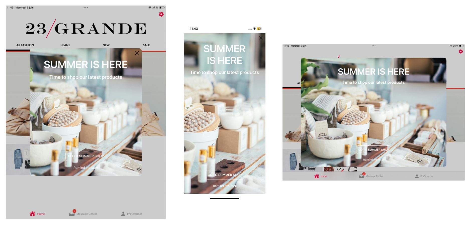
Sometimes a Scene that looks great on a phone screen in portrait orientation doesn’t deliver the same impact on a tablet in landscape. Using conditional overrides, you can be sure your Scenes display as fullscreen on smartphones and modal on tablets, along with the orientation that best represents your content.

Using a fullscreen view style as an example, without overrides the Scene is displayed as fullscreen on all devices in any orientation. On a large device, such as a 12.9" iPad Pro, this can be overwhelming. For a better experience, you could add overrides for these display scenarios:
- Large device in landscape orientation: Set height and width to 80%.
- Large device in portrait orientation: Set height to 60% and width to 70%.
These overrides ensure that when viewed on large devices, the Scene is reduced to a comfortable viewing size. It displays as fullscreen on all other devices.
You can add overrides for modal and fullscreen view styles in your project settings or when setting the root appearance for a Scene. See:
- Set fullscreen and modal view styles in In-App Experience Defaults
- Set the root appearance in Configuring Scene content
While creating a Scene, you can use the orientation and device/screen size preview tools to see how your content will appear when a device is rotated and when viewed on specific devices and screen sizes.